Urban Design

Stenciled Bikes

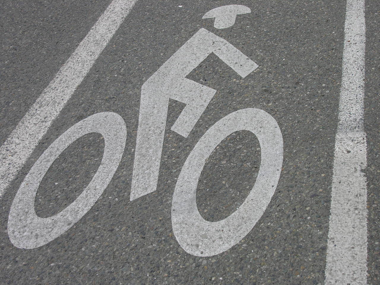
[caption id="attachment_1774" align="aligncenter" width="700" caption="Bike lane outside Schemata Workshop on 12th Avenue."]Bike Lane[/caption] Much like Katherine I decided that May, official Bike to Work month, was a great opportunity to recommit to biking to work.  I was a fairly regular bike commuter five years ago when I worked downtown and lived in Greenwood but since then I’ve either worked close enough to walk to work or was on the road traveling for work.  The biggest difference I notice about biking now versus five years ago is all the new bike lanes, green bike lanes at intersections and sharrows (shared-lane markings) painted on the city streets.  These white stenciled bikes painted on the streets definitely make me feel like a more ligitimate user of the roadways.  As a biker I’m always hyper-aware of the dangers present when on the road.  Simple things can lead to dangerous accidents when you are on your bike such as a car door opening while passing parked cars, a car turning right across my path without noticing me, a car pulling out of a hidden driveway, the unaware driver at the four way stop who hasn’t noticed me, a newly formed pothole waiting to devour my bike, and the list goes one.  There are some drivers out there that get frustrated sharing the roadway with bikes but thankfully I have personally found those few and far between. The more common problems I’ve encountered with cars are that we bikers are just not super visible.  The good news is the image of my bike painted on the street seems to go a long way to remind my fellow car-driving road users that I and other bikers are also using the road. Seattle bike system may not be perfect and we have some ways to go before I would truly call us a bike friendly city but I am one biker that is happy with the direction we are headed.

On one of my evening rides home this month I decided to take a detour through downtown and head home along Dexter. It was fun to see the new road improvements currently underway that will create more buffered space between cars and bikes.  Later when I was looking up information about the construction I was surprised to learn that Dexter is one of the highest used bike lanes in Seattle but currently does not actually meet SDOT bike lane guidelines.  This is soon to be changed! The upgrade to Dexter will provide a substantial buffer between cars and bikes.  Most studies show buffers decrease serious bike-car accidents.  Dexter was originally slated for a Cycle Track, a two way bike lane separated from car traffic, but there was  debate on how much added safety (if any) these Cycle Tracks provide and if they were a actually a good fit for Dexter given the uses and layout of the street.  After community feedback the Dexter design was ultimately changed to provide buffer space between cars and bikes but not a Cycle Track.  That said SDOT has other Cycle Tracks proposed throughout the city. Community groups and SDOT are currently working to develop Cycle Tracks in a way that both increases bike ridership while providing added safety.

[caption id="attachment_1775" align="aligncenter" width="600" caption="Dexter road improvements currently underway will add buffered bike lanes."]Dexter Road Improvements[/caption]

Dexter and the proposed Cycle Tracks are not part of my daily Greenwood to Capitol Hill commute but I’m still very excited for these projects.  New bicycle road improvements encourage more car commuters to become bike commuters. More bike commuters increase bike awareness for drivers and bikers alike. More awareness leads to better and more creative solutions that keep bike commuters safer.  Safer bike commuters lead to more bike commuters…. It’s a feedback loop that will continue to lead us towards a more bike friendly Seattle. And this ultimately leads to a more environmentally friendly way to get all of us to work!

The Italy of the Italians Part 2: Mantua, a Beautiful & Compact Renaissance City

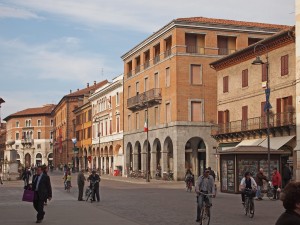
We began our tour in Mantua, the smallest of the three cities on our main itinerary. With a  current population of around 50,000, it rose to prominence during the Renaissance primarily under the Gonzaga family whose authoritarian rule lasted over 300 years. Subsequently, Mantua was ruled at various times by the Austrians and the French until Italian unification in the mid 19th century. Being compact, it provides a wonderful primer on the cities of the region, as well as their more famous brethren in Lombardy and Umbria. Its main piazza, as well as smaller ones adjacent to it, are joined by a network of pedestrian ways, and defined by churches, lesser palazzos, and shopping arcades. The flat terrain makes it an excellent city for cycling.

[caption id="attachment_1657" align="alignnone" width="700" caption="Men Sharing Stories, Piazza del Erbe"][/caption]

The main piazza (Piazza Sordello) has the traits that will be a recurring typology thorough out the cities visited: a central piazza, defined the palazzo built by the ruling family, a duomo or church, and some administrative buildings. The uses have changed (with the exception of the duomo), but their role remains the same: that of providing a strong spatial definition with buildings having either a porous ground floor, or sufficient open space adjacent to them to allow for furniture, seating walls, or steps which provide comfortably scaled space about which to gather. Typical too, is that the palazzo now houses a museum or other civic building of note, not the posh residence of the ruling elite. Below, the Palazzo Ducale is to the right, and the duomo to the left. The balconies of an adjacent palazzo (not shown) was where the rulers would cage criminals (or rivals), to die of exposure for all to see. Despite this morbid lineage, its new role the civic museum is as well suited to its location as when it was the home of the ruling elite: being at the center of things and the most prominent building in the central city. The building's uses represent the evolution of the 1000 year old social order, from authoritarian rule to democratic rule; or, a building whose use was by the minority to one whose use is enjoyed by the majority. And as a typology, as a living form of urbanism, this progression was fostered by clarity of plan and hierarchy, enabling such a drastic change in governance (and therefore use) to happen.

[caption id="attachment_1659" align="alignnone" width="700" caption="Piazza Sordello & The Palazzo Ducale"][/caption]

Opposite the Palazzo Ducale is the palazzo of the ruling family whose tenure ended when the Gonzaga came to power. Beyond one can see the dome of the famous Basilica San' Andrea. It is interesting to note that when the Gonzagas deposed the previous ruling family, they choose to build their new palazzo opposite the extant, as the former regime had consecrated the Piazza Sordello as the city's most important space a spatial and therefore political ordering that the city's new rulers were smart to capitalize on. Today, the city's residents continue its importance, by making it the most concentrated social space in the city, as witnessed by the many filled cafe tables.

[caption id="attachment_1615" align="alignnone" width="700" caption="Piazza Sordello & Palazzo Bonacolsi"][/caption][caption id="attachment_1668" align="alignnone" width="700" caption="Piazza Sordello and the Palazzi Bonacolsi & Vescovile"][/caption]

Throughout our stay in Mantua, Italian was the only language to be heard. Though a splendid city indeed, a gauge of Mantua's relative wealth at its apex could be deduced by the paving material of the Piazza Sordello, which is uncut rock, laid in a random pattern (as opposed to cut blocks, or the fancier stone paving tiles of larger cities). Though it may prove a challenge to one wearing high heals, the simple paving does the job well, even if it was a relatively low-budget approach to such an important space. Below, people enjoying on of the many pedestrian ways of Mantua as a simple promenade; not spending, not shopping, not eating, just enjoying. Originally scaled around the pedestrian (for horses and carts were not only smaller than today's automobiles, but were rarer and only available to the wealthy), it is nice to see  many of the streets of Italian cities return to their pre-automotive past and emphasize pedestrian uses.

[caption id="attachment_1658" align="alignnone" width="700" caption="Mantua Streetscape"][/caption][caption id="attachment_1669" align="alignnone" width="700" caption="Piazza del Erbe"][/caption]

Pictured above and below is a the smaller Piazza del Erbe, where several shopping streets converge. No large palazzos here, just colonnaded shops and housing of what were probably merchants and artisans. Today, its less formal nature is perfect for families to gather, and kick around a soccer ball. Its more casual demeanor is best suited to standing interactions among residents, not the more formal dining that occurs in Piazza Sordello. It was nice to see two public spaces immediately adjacent to each other, of about the same time, but with very different personalities. Personalities that could be traced back to the cities origins and their original uses.

[caption id="attachment_1621" align="alignnone" width="700" caption="Piazza del Erbe Adjacent to Piazza Sordello"][/caption]

As day turns into evening, the buildings themselves become more distinctive, and the space defined more mysterious. The contrast between the well-lit ground floors and the darkened upper floors lends this piazza a welcoming glow, yet at the same time a haunting ambiance. And though lacking throngs of visitors, there are just enough residents milling about to make one feel comfortable and safe. It is interesting to ponder just how many people need to inhabit a space to make it work. The prominence of the tower lends importance to the space.

Mantua's significance in Italy's architectural history is assured by its two most significant buildings, each being a masterpiece of their respective authors: the Basilica of San' Andrea and the Palazzo del Te. The basilica is one of the few realized built works by one of Italy's most famous classical theorists, Leon Battista Alberti, whose On the Art of Building in Ten Books is one of the seminal treatises on architecture, and was penned in the mid 15th century. Alberti's basilica has a stunning interior that has recently been restored (its exterior was shrouded in scaffolding, and is hence not pictured), to great success. The barrel vaulting of the space pictured below, is what distinguishes it as a basilica, a typology founded upon Roman precedent, though its original use was as a market not a house of worship.

[caption id="attachment_1625" align="alignnone" width="700" caption="The Basilica of San' Andrea"][/caption]

I remember fondly Romano's masterwork, the Palazzo del Te from my architectural history courses. Perhaps Italy's most famous secular building, it was the pleasure palace and stables of the Gonzaga family, and is located just on (what was then) the outskirts of the city, and is adorned with festive and at times ridiculous frescoes depicting Greek gods, and well, partying. The interiors are in fantastic condition (no photographs allowed), and the exterior (as shown below), demonstrates an almost perfect knowledge of scale, balance, and proportion. With such an outstanding urban fabric, and two world-class buildings, it is easy to understand how Mantua became a UNESCO world heritage site in 2008.

[caption id="attachment_1672" align="alignnone" width="700" caption="Palazzo del Te"][/caption]

As I re-trace the steps of my recent sojourn in the north of Italy, several themes will become apparent: How have spaces' uses evolved over time, while still maintaining their function; what are the commonalities of those uses/functions, and what lessons going forward can they serve us today, in our time, on Capitol Hill, that will help us further the quality of our neighborhood. Up next: Ferrara!
The Italy of the Italians Part 1

Italian culture is arguably the single most important contributor to western civilization. Whether in the arts, sciences, commerce, or even governance (current intrigues, of course, excluded) both the legacies of individual such as Michelangelo, Galileo, Lorenzo De Medici, and Justinian, or the collective influences of the Renaissance and Roman Empire of which they were are part, the Italians' contribution to our way of life is immeasurable and profound. A living testament to this legacy is found in the many fine cites throughout Italy, a few of which form the basis of this series of posts. [caption id="" align="alignnone" width="300"]

Mantua Skyline[/caption]

Having seen many the cities one typically thinks of when thinking of Italy, my recently completed trip focused on what one may call second (and third) tier cites, in this case mostly in Emilia Romagna. I use the term second and third tier advisedly, for the cities visited are amongst the finest urban environments anywhere, and their lesser notoriety in not a slight to their beauty or charm, merely the lack of recognition of their qualities amongst non-Italophiles.

Visiting Mantua, Ferarra, and Bologna (along with brief stopovers in Modena, Parma, Turin, and Varese) was an opportunity to see a side of Italy unavailable to those whose focus is only on the country's most popular destinations. Unavailable, because those cities are filled not only by their residents, but also throngs of visitors, whose impact on the cityscape is significant. Without the crowds and tour buses, one can arrive at a better sense of how these spaces function on a day-to-day basis -- to see how they function as working cities – and not merely places of leisure. The public spaces visited were filled with the population of the city served, allowing a more tangible measure of their utility and their successes.

[caption id="attachment_1606" align="alignnone" width="300"] Ferrara Streetscape[/caption]

Italy, of course, was not a nation until 1861, so I use the term Italians not to describe a nation in the contemporary sense, but really the group of people who shared a common language and a common history. Unlike say France, Great Britain, or Spain, there was no country of Italy ruled by a powerful gentry (much of Italy was in fact ruled by foreign powers). What it lacked in national unity it made up for in strong regional identity forged by leading cities, with each being the head of government, commerce, and culture for the region. Each primary city was therefore, a distillation of all of the qualities we identify with modern nation states. We too have cities such as these today: London, Tokyo, Paris, and so on, each the cultural, financial, and governing capital of their nation. What is remarkable about the Italian cities described here, is they achieved comparable levels of greatness in their own time, with populations of maybe 30 to 60 thousands and not millions. This compact size relative to greatness allows an intimate relationship to be forged,, even during a brief sojourn.

[caption id="attachment_1597" align="alignnone" width="700"] Bologna the City of Colonnades[/caption]

Mantua, Ferarra, and Bologna’s origins can be traced back prior to the Roman Empire, though they did not flourish until the late Middle Ages or the Renaissance. In addition to this shared imperial heritage they rose to prominence while ruled by a leading family, whose power came from commerce, banking, or land holding. They were also the seats of bishops. Perhaps it was the concentration of governance (both secular and ecclesiastical) and commerce, and its resulting artistic patronage, which fostered these city-states to greatness. A physical manifestation is to be found within the constructs of the city itself. And even though some grounding in history would help one arrive at a conclusion with greater haste, the observant traveler is bound to come to similar conclusions. The palazzo and duomo fronting the piazza (the traditional market place) is an urban typology typical to almost all cities visited; or, in other-words, both the secular and sectarian seats of power defining the place of public assembly and commerce. Always in the center of the historic city, and always easy to identify by the splendor, size, and regalia of their construction, this logical assembly of edifices imparts to one a knowledge of arrival and of place. With the exception of the duomo, the uses of the buildings may have evolved to our present day, but their function has remained the same: clearly designating a hierarchy of relationships and methods of interaction among the citizenry of the city. And though predictable, there is certainly an abundance of variation within the typology to lend interest to each town visited.

Don't Let Them Fool You . . .

Contrary to what you might hear, boxy buildings are okay. Even relatively big ones. What is not okay, however, is anti-box propaganda founded upon misrepresentation. There was a time, we are told, that there were no boxy buildings, that buildings were neither massive nor unarticulated, and that in order to have new buildings be good urban neighbors, they need to acknowledge this pre-box precedent. Living in a world of make believe, these Tinkerbells of design (to include architects, Design Review Boards, developers, and concerned citizens) spread their anti-box fairy dust, hoping to achieve the kinder, gentler architecture which existed before big, boxy (i.e. modern) buildings desecrated Neverland.  The fact is many (most?) of Capitol Hill's best heritage buildings are boxes, with barely a change in massing or material, and elevations that remain remarkably the same from one corner to another. These best buildings are in fact, about as boxy as a box can be. Despite ample, recent built examples to the contrary, the Tinkerbells continue to believe that the modulation of a building’s mass, both horizontally and vertically, and composing it of as many distinct materials and colors as possible, leads to good design. This has not worked, and it is definitely not precedent-based. What this modulation and material mayhem is, is design by check-list. As long as each box is checked, the final result seems to be irrelevant. What is lost in this paint-by-numbers approach is the detail -- literally. For it was (and is) in the details of a window opening or in a material transition that human scale and texture of our heritage (and modern) buildings was achieved. In was (and is) those elements of a building that can be held in one's hand, that can be understood at eye level while passing by, that add scale and 'humanity'. Not design approaches that, due to their grand gestures, can only be comprehended from across the street or down the block. While it is true that color, material differentiation, and expressive massing can add interest to a building, it is no substitute for the richness added by detail and craft. In fact, I would be more than happy to see buildings such as the one below (designed by pb elemental, on 12th Ave and John) that have some nice detail and are volumetrically and materially expressive. But let's stick to basics first before we venture into more adventurous design, and have a look at a range of Capitol Hill boxes.

[caption id="attachment_1343" align="alignnone" width="700" caption="12th Avenue and John Street"][/caption]

[caption id="attachment_1309" align="alignnone" width="700" caption="Broadway and John"][/caption]

Above, one of the few heritage buildings on Broadway that is of suitable scale for the street's importance to the neighborhood, and a fine, anonymous urban building. The terracotta surrounded residential entrance is on John, and is the only part of the building that strongly asserts itself against the predominantly brick exterior.  The ground floor and top floor are expressed by only contiguous lines of terracotta. There are, I believe, only two types of windows, and for all intents and purposes, one material and one mass. Small medallions are located at floor lines of the third, fourth, and fifth floors to add a little sparkle. The building's John and Broadway corner is unapologetically non-celebratory, nicely matching the rest of the building.

[caption id="attachment_1307" align="alignnone" width="700" caption="Belmont and E Howell"][/caption]

[caption id="attachment_1306" align="alignnone" width="700" caption="Belmont and E Howell Entry"][/caption]

Exhibiting greater boxiness, as well as greater size, than the Broadway and John building, The Granada at Belmont and E Howell is among the largest apartments on Capitol Hill and reminds me of similar apartment buildings in other large American cities. It is a time tested typology. And though I would not want an entire neighborhood of them, its very restrain adds to its grandeur, making it a robust urban building. Sadly, though, I need not have that concern; for, based on current zoning it is too large for our neighborhood in height (per zoning), and its unarticulated breadth is relentlessly long (per design guidelines). As above, the base and top are distinguished only by lines of terracotta, while the upper floor windows (of only two sizes) have an terracotta header, and those at the ground floor have a keystone set within a brick jack arch. The entrance is perhaps a bit diminutive given the building's heft, but there is no denying that it handsome and well executed -- a result of concentrating resources to where they had the greatest impact. Note the fine lamps. This building is indeed a big, flat -- yet classy -- box.

[caption id="attachment_1311" align="alignnone" width="700" caption="Bellevue between Pike and Pine"][/caption]

A favorite medium sized apartment building tucked mid-block on Bellevue, along the Pike-Pine Corridor. While at first glance it appears to be little different from the above two examples, this building employs a slightly different design strategy. Here, the windows are of uniform size and placement, and the middle floors have no distinguishing elements. Whatsoever.  Instead, the architect decided to focus efforts on a luxurious base and sumptuous roof parapet. As in the previous examples, the facade is essentially dead flat (but none the worse because of it) save for some slightly projecting trim at the second and third floor lines (why distract from the gorgeous base?). A carefully selected brick color nicely completes the material palette, and a well detailed canopy marks the building's entrance. One of the better examples on the Hill for the much coveted 'base-middle-top' design approach. And a box to its bones.

[caption id="attachment_1303" align="alignnone" width="700" caption="12th Avenue and Madison"][/caption]

A handsome edifice, indeed. The heritage portion of the Trace Lofts (the tan brick base) takes the above examples to a next logical stage: greater articulation of the facades (but wait, here's the crazy part), while maintaining material integrity and uniformity! Not prone to exuberance, the designers wanted something a little different, which is great. What is equally great is that they found it not going hog wild with garish colors and monstrous modulations, but with subtle detail and nuance of the overall design approach. Major structural elements are expressed as bays, with a secondary reading afforded by a subdivision of said bays into three more sub-bays. The cornice is more pronounced than in the previous examples, and there is a pre-cursor to the structural bay/ infill approach occurring on the ground floor, and advanced in the next two examples. Why not change materials you ask, why not a more pronounced modulation? Because it was not needed.  And by keeping the material the same, the changes stay calm and quiet -- not screaming, not annoying. And kudos to the architects (Johnson Architects, I believe) of the top floor addition. It is black, it steps back, and it disappears allowing the real focus of our attention -- the original building -- to remain at center stage. And just look at that corner. What confidence!

[caption id="attachment_1301" align="alignnone" width="700" caption="Union and 11th"][/caption]

[caption id="attachment_1310" align="alignnone" width="700" caption="Union and 10th Avenue"][/caption]

A street of buildings built like the two above would be just fine with me. A robust, concrete frame, with brick infill and large windows (almost always a winning approach) mark these two buildings as a transitional typology; one that was based on based on a rationalized constructional process optimized for an industrial economy. All bays of the buildings are essentially identical. This repetition works, though, because there is an understandable progression from the largest elements (the bays), their subsequent division and expression into individual floors (not two floors pretending to be one), to the texture within each bay; a texture created by a clearly expressing the structure verses the infill. The windows and their structure introducing yet another scale, and one arrives at a clearly understandable intermixing of materials, scales, and textures. It gets my heart racing.

At Olive and Summit we have a building, the Biltmore, which defies easy categorization, so I won't try. Suffice it to say, there is quite a bit going on here: funky corner, hyper active parapet, bay windows, and some major changes in massing. Yet despite these potential identity rending moves, it still reads as one building. What's wrong with that? It is one big building, and it is just fine that it is not trying to look like two (or more) buildings. The stepping back of the mass, of course, helps to mitigate its size; yet notice, the materials and details do not change. The stepping back was enough, and I suspect that all of the visual gymnastics of the terra-cotta, bay windows, and crenulations weren't for the purpose of making a large building to  appear to be two or three smaller buildings at all (wink, wink), but merely an architect’s eclectic vision of a single building. No remorsefulness here. And probably, no design review board, either.

[caption id="attachment_1304" align="alignnone" width="700" caption="Trace Lofts"][/caption]

Fast forward to current development. The (new) Trace Lofts is a good example of an understanding of the precedent set by the previous examples. The massing is simple, and where it steps back from the street, it does it in a bold way that creates a pleasant space for an adjacent restaurant to utilize (not a private, gated courtyard). A clear, structural frame orders both the ground floors, as well as the upper, and huge windows (with nice, shinny aluminum frames) continue the breakdown of scale while contrasting with the dark grey metal panels. Because they are floor to ceiling, the windows require guardrails, whose finish matches that of the windows and adds more (perhaps,too much?) visual interest. And finally, the metal siding. Hurray for actually designing the metal siding's profile, instead of taking it off the shelf. The bold horizontal lines succeed at reducing the buildings mass, and their strong profile adds shadow lines to the metal siding. And hey, since building codes require the building's base to be made of concrete (for fire issues), why just not leave it be? Good choice. Johnson Architects.

[caption id="attachment_1300" align="alignnone" width="700" caption="The Pearl"][/caption]

Although not as well executed as their commendable Agnes Street Lofts (nor with the same budget I would imagine), Weinstein A/U's Pearl Apartments advance some of the strategies of Agnes and is worth a look, none the less. With the frenzy surrounding modulating facades, and a typical solution being bay windows, the strategy here is relatively novel and definitely worth supporting: subtractive bay expression. Subtractive bays you say? Yes, in so much that the mass of the building remains intact, but smaller voids are introduced between them, creating bays. Although not employed by the historic examples noted above, it is of the same lineage: it relies on (dimensionally) smaller expressions to achieve its ends of breaking down mass. Similar (superficially, at least), to the rusticated base on the Granada Apartments, above, where recessed bricks add a subtle dimensionality.  The integrity of the building is maintained, while (many) smaller scaled interventions add (a great deal of) texture. A nice progression from large to small, and a very modern approach. Let's see some more -- subtraction!

Let's Not Celebrate that Corner

An architect's desire to 'celebrate' a building's corner has become so defacto that she or he may be seen as some kind of subversive if they were to do otherwise.  My corner problem, as I call it, lies not so much with the intent of being expressive, but in its recent, almost universally poor execution. So much design effort is expended on corners today, that they have become buildings onto themselves, resulting in chaotic assemblages of parts reminiscent of Ms. Shelley's infamous antagonist, but in built form. Garish colors and materials, clumsy canopies, little hats for roofs, and shifts in the building plane (often all together) are common ingredients in this over-cooked entrée. To make matters worse, such celebratory excess is often couched in a building's need to be contextual (i.e. historical). The fact of the matter is that for hundreds of years most buildings were quite content to go about their business in a dignified manner, either blissfully ignorant of their proximate influences, or, if feeling a bit provocative doing a little something extra at the extremities. The goal was not to make the corner an end onto itself, but to make it a part of an overall design. [caption id="attachment_933" align="alignnone" width="661"] Carson Pirie Scott Department Store, Chicago, IL (Source: Wikipedia)[/caption]

Carson Pirie Scott Department Store, Chicago, IL (Source: Wikipedia)

There are, of course, great buildings whose excellence has not been diminished by a corner folly here or there; and, dare I say, have even been enhanced by them. Sullivan's Carson Pirie Scott department store comes first to mind. Here, a gentle curve  of the same material that surrounds it, gently acknowledges its prime location. Another distinguishing feature of Mr. Sullivan's masterpiece is that of its window/structural bay expression going from horizontal to vertical, no doubt a recognition of the structural requirements needed to accomplish the move. Inspired by such a successful example, I set out on a grey January Sunday with camera in hand to see what local lessons on corner propriety could be discerned from our very own Capitol Hill, with the hope that not all buildings in the neighborhood suffer from the corner problem and that I may be able to document those that do not.

Certainly a corner does not a building make, and a couple of the buildings in the photos contained herein are part of rather uninspired design; however, those buildings have corners that are at least pretty good, and provide some thoughts as for strategies for designing an expressive corner (or not) for reasons other than an ungrounded and misguided nostalgia for buildings as they once were. The photos start from a working proposition that, to quote Hypocrites, first do no harm; or, at the very least, one should first aim for simplicity and only resort to rhetorical flourishes with discretion, forethought, and an understanding of the 'precedent' cited.

Agnes Lofts

Above, is Agnes Lofts, one of Capitol Hill's most recent (and best) mixed used buildings. The body of the building is so nicely executed, one wonders why change anything at the corner; thankfully, the accomplished architects at Weinstein A + U felt the same. Well done. Note also the nice subtractive bay modulation on the far left. Well done. Again!

The Velo Bikes building can be seen as a precedent to Agnes Lofts (or not -- your choice). Design a handsome edifice with beautiful terra cotta and generous windows, why change a thing at the corner? What could be a more appropriate approach (or more effective)?

[caption id="attachment_1006" align="alignnone" width="1024"] Seattle Central Community College Broadway Performance Hall[/caption]

At Seattle Central, we have a subtle, yet robust corner. If only more buildings had the confidence to rely on the selective expansion of their existing vocabulary: drop the arched window, swap it out with a combination circular and rectangular. For some added emphasis, add some coigning. Inspiring.

This photo, taken earlier in the year, is of a favorite Pike Street building. Lovingly restored by our friends at Capitol Housing (http://capitolhillhousing.org/), this affordable housing, mixed use building at the corner of Boren and Pike has a lovely wooden storefront running its length, which then turns the corner (and even steps back) just so slightly at the corner.

[caption id="attachment_1007" align="alignnone" width="849"] Seattle Police Department East Precinct[/caption]

Here is a rather ordinary fabric building that continues the evolution of the above themes. The regularity of the building's structural bays is exposed at the corners as the windows push back, signifying the entry. Note the view beyond to Eltana Bagels. A nice logical progression, should one want to add a little corner zest.

[caption id="attachment_1005" align="alignnone" width="740"] Apartment at Harvard and Roy[/caption]

There are several of these roadside -motel-inspired (ouch) apartments on the Hill. I have a certain fascination for them, as period pieces more than anything because for the most part they are not very well done (parking dominating the front is a poor display of urban manners). None-the-less, the corner here is notable in that it actually contains a programmatic element - the stairs - and hence, perhaps, a reason for expression (can you imagine, the willfulness!). Want to emphasize a corner and give it some panache, put a stair there and surround it with glass. Very mod.

The best new building on Broadway built during our last boom (sadly), this competently designed building does have a nice corner -- and an architect's favorite -- to make a corner expressive, make it go away. If done well, as this is, it is an trustworthy and reliable companion. Mithun Architects.

A favorite  corner of the day (or any day), and for a couple of reasons. It is simple, it is clear, and it is simultaneously distinct from the rest of the building yet wholly of its vocabulary. Nice. And, best yet, it houses a space that is of a different character than the remainder of the building. An expressive corner that actually expresses something inside! Bravo. Johnston Architects in collaboration with Cutler Anderson Architects.

Below, inside the corner window. And across the street, well, a corner problem.

[caption id="attachment_1000" align="alignnone" width="912"] Seattle Public Library Capitol Hill Branch[/caption]

Arguably the best corner on a building (or corner building -- a typology?) on Capitol Hill, and finally with a suitable ground floor tenant. The architects of this 1900's beauty designed the boldest of the bold in the world of corners -- they curved it. This is perhaps the most frequently botched corner-solution, leading to many a corner problem, yet done here with smashing success. How? because the materials, modulation, and detail are grounded in the remainder of the facades. One of our best heritage buildings, corner or otherwise.