Strength in Numbers

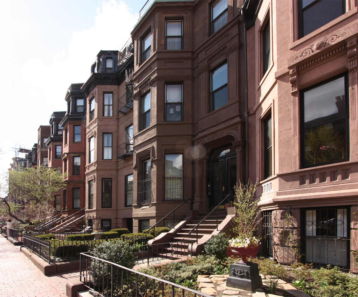
In cities and settlements throughout the world the repetition of even a passing resemblance between neighboring structures has lent dignity to many an urban environment.  Siena, Italy, comes to mind as an instance of the first order, where the matching architectural qualities of the city define its great beauty. Closer to home, the justly famous brownstones of New York (so-called because they were built of locally sourced, brown stone) are among some of the country’s finest residential neighborhoods.

Source: Wikimedia

Yet this repetition can be a double-edged sword. Our ubiquitous suburbia is the most banal of environments, with its cookie-cutter homes and shopping malls, endlessly repeating the same massing, materials, and details, resulting in pure misery.

On Capitol Hill, we too have instances of matching buildings, which run the gamut from those that enhance our neighborhood to those that tarnish it. 10th Avenue East, between Aloha and Roy Streets, holds forth a positive example of repetitive buildings. Architecturally, these facing comrades are virtually identical, with two on the western side of the street and four on the eastern side. I have long been a fan of these six buildings, not only because they are dignified little structures, but because their repetitive nature highlights their individual qualities.

Copyright 2013 John M. Feit

Besides the match of overall form and materials, sameness is provided by the stairs, building set-backs, and the landscaping, much in the manner of the above-mentioned New York City brownstones. Yet unlike them, these masses are separate, allowing for additional shared elements to present themselves, such as alleyways, facing facades, and archways.

Broadway 4 Detail 1 Small.jpg


Copyright 2013 John M. Feit

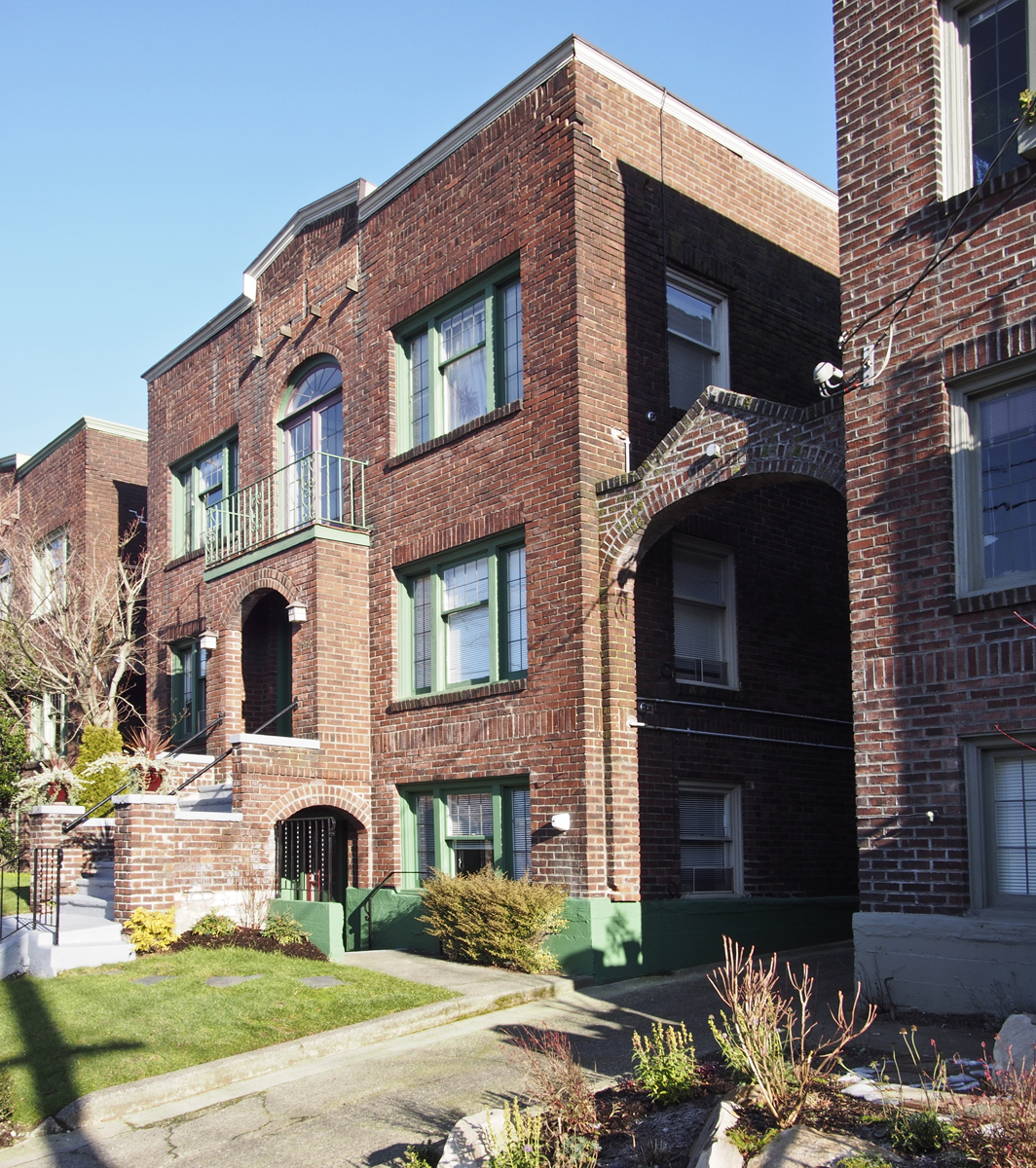
The fact that they share characteristics raises some questions that no one of them standing alone could: Were they built all at the same time? Are the floor plans identical? Was there a specific tenant in mind? Did the same developer build both sides of the street? The answers themselves are not really important.  What matters is that the curious uniformity and repetition has some sort of story behind it, prompting questions that enrich one’s experience.

Further north on 10th Avenue East at the northern extremes of Capitol Hill, one finds a striking threesome of buildings that are identical in all but name. Much larger (individually) than the six to the south, these three provide an anchor to their section of 10th that confirms one’s presence in an urban neighborhood.

Copyright 2013 John M. Feit

In addition to being rather handsome, well-proportioned buildings in their own right, the fact that they match, have the same negative spaces between them, and uniformly step down along 10th Avenue reinforces their presence, strengthening the streetscape and sense of place. Though the three lack the additional matching elements of the first example, their more cubic nature and repetitive fenestration lends them an equally strong character.

Copyright 2013 John M. Feit

My favorite matching buildings on Capitol Hill are, actually, the least matching of all. The Buckley and Sheffield apartments, while not identical like the above apartments, convey a different and perhaps more powerful example of the matching theme through their sharing of a rather unique element: facing corner entries. There is even a third building nearby -- an odd-one out -- that still provides continuity with the others due to a similarly high level of material and detail.

Copyright 2013 John M. Feit

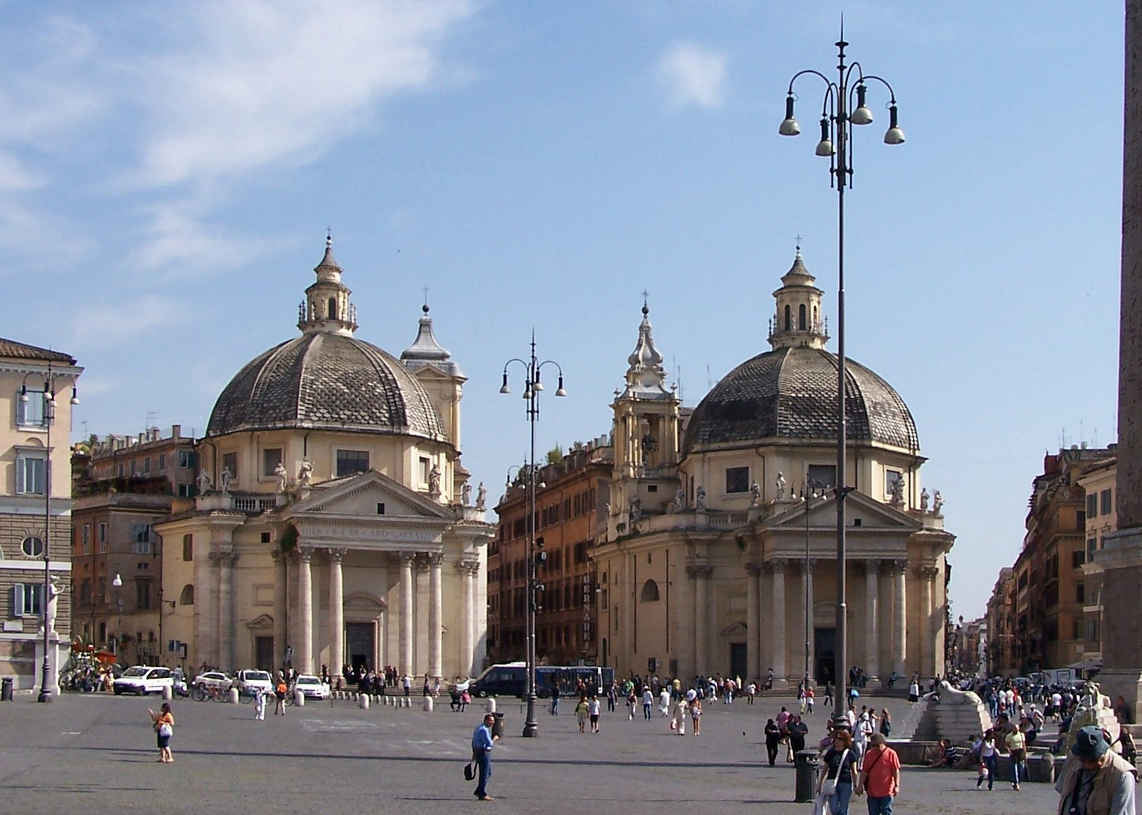
Placed within a (very) broad historical context, I cannot help but to be reminded of one Rome’s most famous landmarks, the "twin" churches of Santa Maria in Montesanto (1662-75) and Santa Maria dei Miracoli (1675-79). Back in the day, this kind of intentional design – matching buildings to form an urban gateway – was novel and rather groundbreaking and required a big, urban type of thinking that had hitherto been rare. Unfortunately, such larger urban thinking in smaller environs such as Capitol Hill remains elusive, one reason why the Buckley and Sheffield merit special attention.

Source: Wikimedia

The mirrored pairing of the Buckley and Sheffield is but one of their notable attributes, as the buildings’ execution is a step above typical, Capitol Hill apartment building fare. Subtle brick patterning and terracotta trim indicate the higher aspirations held by the developer. A peek into the lobbies through the stained glass windows reveal that equal attention was paid to the interior environment. Though this pairing may be without precedent on the Hill, it is not without descendants.

Copyright 2013 John M. Feit

Directly to the south of the Buckley is the Whitworth, whose detail and material exceeds the vitrual twins across the street. More questions arise – were these three planned together, and if not, which came first? Did someone anticipate the city arriving, and the rest of the surrounding single-family neighborhood never caught up, leaving these three urban pioneers stranded? Whatever the answer, the mere query suggests there may have been some sort of planning in the entire collection, of thought given to a neighboring context and a choice to create one anew -- indicating big ideas for this little intersection at East Harrison and 17th Avenue East.

Copyright 2013 John M. Feit

Despite the above examples, such repetition, use of thematic elements, and uniformity of height, bulk, and scale, has led to disastrous results.. In the case of much suburban development the obvious reasons include the lower quality of design, including the lac of design of the larger environment inhabited by the structures. Probing more deeply, I would include quality of materials,  the use of well-executed and scaled details and thoughtful material interfaces as contributors to Capitol Hill’s fine examples.. Compactness and density too, play a role in establishing the higher quality of Capitol Hill’s matching buildings; yet bad examples are present on the Hill as well, proving that there are no guarantees for success in design and that we are at least fortunate enough to have some good precedents to follow.

Louisa Boren Lookout

Image from Wikipedia

Image from Wikipedia

Despite writing little about it I am a great admirer of landscape and Capitol Hill is a fabulous place to explore landscapes both grand and intimate. One of my favorite Capitol Hill landscapes, and the first of what I hope to be many blog posts on parks, take full advantage of our neighborhood’s surname and presents one with a grand view of Lake Washington and beyond. Named after one of Seattle’s very first European settlers, Louisa Boren, Louis Boren Overlook (park) comprises a little over seven acres, most of which are on a slope connected to the much larger and wooded Interlaken Park.

The big draw is the tremendous view it provides one the opportunity to enjoy. The park also has many design elements of a smaller scale which work almost transparently to reinforce the powerful vista. Included among these elements is a running path bisecting the upper portion of the park. The path provides a nice venue from which to engage both the distance views of Lake Washington and the Cascades, as well as some of the neighboring homes.

Copyright 2013 John M. Feit

Copyright 2013 John M. Feit

Copyright 2013 John M. Feit

Copyright 2013 John M. Feit

The path is framed by higher ground to its west (non-view) side; the mound also forms a visual and acoustic barrier to the heavily traveled 15th Avenue as well as a nice sense of enclosure, reinforcing the view to the east. The curb, seen to the far left of the above image, provides the subtlest of definers, gently offering a modest edge just before the land drops about 180 feet into Interlaken Park.

Copyright 2013 John M. Feit

Copyright 2013 John M. Feit

A regular to the park, I can attest that a favorite prospect is defined by a solitary tree, surrounded by a bench and railroad ties. Just right for two people to enjoy; with many a couple being seen there at any given time.

Copyright 2013 John M. Feit

Copyright 2013 John M. Feit

To the southwest of the lover’s bench, there is a 1975 sculpture in raw steel by Oregon artist Lee Kelly, sited on the highest grade in the park.

Copyright 2013 John M. Feit

Copyright 2013 John M. Feit

Copyright 2013 John M. Feit

Copyright 2013 John M. Feit

Copyright 2013 John M. Feit

Copyright 2013 John M. Feit

The park’s real treat is, of course, its view. In any season, and with a clear sky, the democracy of our Seattle park system reveals itself giving to us all views that are typically reserved to a select few. The view is particularly captivating if you are fortunate enough to catch it on a clear winter’s day, when sunlight bathes the freshly fallen snow in the Cascades, distinguishing their noble profiles and as it did on a clear and cold morning January 2nd, 2013.

The Kingshire: A Mid-Century Sleeper on Harrison

Every time I walk by the Kingshire, at the intersection of 14th Avenue  East and  East Harrison, I flatter myself and wonder if I am the only one who appreciates its dignified and restrained design. After all, it is only a white box with a relatively flat facade and an entry that hardly gives one pause. Despite these attributes (or because of them), the Kingshire is a little beauty with a subtle complexity to it and is a great example of many of the finer points of modernism. Among these is the nifty way the building touches down on its site, with its brick façade wall held up by diminutive pipe columns supporting a steel lintel. Both the scale of the columns and the void they create are certainly a reference to the design prerogatives of modern masters such as the Swiss architect Le Corbusier, whose pilotis (columns that allow for the raising of a building in order to let the landscape pass underneath) became a modernist icon.

The Villa Savoye (1929)

On the Kingshire, the height afforded by the columns is of a decidedly smaller scale than that of the Villa Savoye, and most likely is a recognition of this building’s urban setting and its need to create a strong street edge. The roof too makes a nod toward Le Corbusier, with its lushly planted roof garden and well-tended foliage gracefully hanging over the parapet. Between the pilotis and roof garden (and setting up the base, middle, and top architects do so love) is the middle facade where the shifting of widow openings and mullion patterns from floor-to-floor, as well as a pair of subtractive windows (perhaps another reference to the Villa Savoye?), reveal the Kingshire to have a host of latent surprises.  Such variety in articulation is a fine example of how even a slight alteration in an otherwise regularized design vocabulary is effective at achieving variety and nuance. Note how the third floor corner windows have either more tightly spaced mullions, a flipped orientation compared to their lower floor brethren, or are even subtractive.  Best of all, these design distinctions a grounded within the building’s simple vocabulary.

Painted white to achieve a certain level of modernist abstraction, the building convincingly uses brick as its skin.  Modernism generally eschewed brick as being too traditional, instead preferring white stucco. None-the-less, the brick here provides a reliably crisp edge around the openings; perhaps the most effective single detail one can lend a building to give it a sense of scale. Built in 1957, the Kingshire is one of the Hill’s most handsome modernist buildings. Sadly for us, there are not many examples of its type, which is a shame as its design has an economy and suitability that would make new derivations of its design precedence most welcome even 55 years later.

Rail-Volution 2012 -- It's (almost) All About the Bike

Rail-Volution is a national transit -- and by default -- urban livability conference that was conceived in Portland, Oregon during the 1990s. Initially focused on transit and how transit can lead to more compact and sustainable development, Rail-Volution has expanded into what must be one of the most diverse urban livability get-togethers in the nation. And naturally, bicycle transportation is figuring more prominently every year. A cycling enthusiast myself, I seized the opportunity to join two (of at least four or five) mobile workshops centered on bicycle transit, and its current and future prospects in Southern California.

The first tour was in Santa Monica, and featured a taxing ride along the Santa Monica Pier and the beach promenade. Our docents included folks from the city, as well a local bicycle advocacy group -- all who voiced great optimism and support for the integration between bikes and transit both currently and in the future.

Along the Santa Monica beach, the city has built a skills course, pictured above. If you look to the upper right of the image, you can see painted lines, replicating those one would ordinarily find riding on the street, but presented here in safe, car-free environment where beginning cyclists can comfortably practice the skills required to ride in traffic. The skills course, which was several hundred yards long and maybe a dozen wide, also had cones and painted, maze-like lines, where one could test and improve one’s stopping and handling abilities. Our docents told as that the skills course was requested by the community, and has been a huge success with those who have utilized it saying that it gave them the courage to ride in traffic, and ultimately leading to a significant increase in new bike commuters. What a brilliant idea.

The well-organized tour also included other infrastructure enhancements that not only encourage cycling, but achieve other sustainable goals Santa Monica has. Pictured above is what we were told was the world's (well, at least California’s) first living street. Features included a woonerf styled profile, where all uses -- including pedestrians, cars, and bikes, share the same, curb-less plane. Parking was over sand set- porous pavers, and the asphalt itself was porous. The three block, formally crime ridden street was built a few years back, and since its completion has been a centerpiece of the neighborhood's revitalization. A particularly nifty feature were the solar-powered street lamps, shown below surrounded by native, drought tolerant plantings that help treat road run-off using with phytoremediation. Also note the typical street signs whose dignity is raise at least a notch or two by steel frames, painted to match the street lights.

And (I suppose) what would be a sustainability-themed bike tour without a farmer’s market. Indeed. The group enjoyed a great lunch at Santa Monica's, which had bike parking for what seemed to be hundreds of bicycles; a welcoming sign, to be sure.

Our tour concluded at the Santa Monica Bike Center in the heart of downtown. A private enterprise, the Center rents bikes and sells bike schwag. Germane to our tour, the Bike Center also has a subscription-based bicycle storage facility, showers, and locker rooms. In the near future, they plan on also being a bike-share location. A great combination of services as well as a model for other aspiring communities, as the profits from the bike rentals offset the lack of profits from the bike storage and showers, allowing for the assemblage to actually turn a profit and have the proprietors not only consider an expanding, but to open other locations as well. Just look as those sexy Saris double-decker racks in the storage room.

Another day found me on a bike tour of downtown Los Angeles. Contrary to popular opinion (including my own), downtown has a rapidly emerging downtown scene, with an intensity and density that was surprising and sure to match or even exceed my beloved Seattle's in only a short time. And it is not only about the new; in fact, what impressed me most about downtown LA (which is where I stayed for the conference, instead of at the conference hotel in Hollywood), was the legacy of outstanding buildings be they 50, 60, or even 100 years old; so much for the myth of LA being only a post-war, automobile oriented city. Give it a decade or so, and LA will be one of our nation’s hippest down-towns to live in. Please allow me to digress a bit, and share a few images of some pre-war, pre-freeway images of downtown that I had a chance to take prior to the conference, that merely hint at downtown’s urbanity.

Especially rewarding were to explore were the many pre-war office building lobbies, the design and materiality of which speak to Los Angles’ industrial and corporate might during the early 20th century (and to this day). I absolutely love the profile of the chemical plant above the entry doors to the former Standard Oil (Exxon, in today's parlance) lobby, which has been repurposed into the tres hip Standard Hotel.

End of digression -- back to the bike tour. Though nascent, LA's bike program is off to a robust start, and reflects California's entrepreneurial spirit. On Spring Street, pictured below, one can see one of LA's test, green painted bike lanes. Still in the vetting stage, we rode on several surfaces that LADOT is evaluating for performance. Just look at the width of that lane -- a full 6 feet as I recall. And one would never guess, but there was barely and outcry, or so said the docents, when a parking lane was removed for its creation. Although I don't recall from what low, bike commuting has increased 200% in total numbers and 600% among women since the lanes were debuted.

Discussion along the way included the late 2012 launch of LA's bike share program, which will begin downtown and feature bike frames made of 100% recycled aluminum. As we meandered our way on bike lanes, soon to be bike boulevards, and other such inspired bike infrastructure I could not but think how impressed I was with the speed, social acceptance, and political will required to execute such ambitions in a city as large -- and auto-oriented -- as Los Angles. While it is true that the weather is simply superb for cycling, and the terrain a bit more hospitable on the whole than say Seattle's is, if a city such as Los Angeles can vision and implement a bike program with such speed and alacrity it speaks well to the movement as whole.