Urban Living

A Tale of Two Spaces

Design of successful public landscapes is a difficult endeavor. Despite the use of good materials and beautiful plantings, and careful execution, there is one key component that can only happen (if one is fortunate) until after all other efforts have been completed: the peopling of the outcome.  For unlike buildings, which have a program guaranteeing that they will at least be used — if not loved — by the public, participation in landscapes is largely voluntary, as landscapes do not have as thorough a set of programmatic requirements (if any) as do buildings. ‘Build it and they will come’ may work for buildings, but not for landscapes. Landscapes, therefore, require a conceptual order outside the confines of the landscape itself, one that artfully blends utility, beauty, and cultural/social relevancy  in order to be inviting. Absent that balance, even the lushest landscape would pass underappreciated and underutilized, and therefore largely unsuccessful. Case in point: Seattle Central Community College’s lovely – but largely unsuccessful – garden-plaza landscape at the intersection of Broadway and Pine Streets, the first of the Two Spaces. Despite having several great attributes (as described below) it is a space that is used only part-time, and typically only when SCCC classes are in session. Part-time success is not be bad per se, except that the landscape in question happens to be at one Broadway’s most important crossroads, and one that needs full-time use, full-time activity. Full-time occupancy.  

The Pine and Broadway Entrance

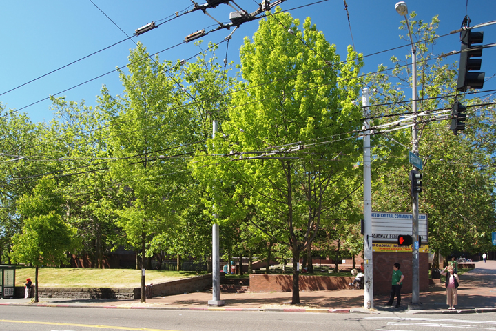
[caption id="attachment_2083" align="aligncenter" width="720" caption="The Pine and Broadway Entrance"][/caption]

As the photos herein depict, the garden-plaza is a surprisingly pleasant landscape, both nicely planted and well sculpted, as well as being a classically modernist design. The London Plane trees (its most immediately recognizable feature) are a traditional favorite throughout North America and Europe, and were specifically bred to achieve urban heartiness — making them a great choice for this location. The visual interest of their exfoliating bark and the dazzling light and shadow portrayed by their canopy is seldom bettered by any other tree, and the well-defined planting rows (allées) could not be more appropriate or truer to the tree’s artistic attributes and centuries-long distinguished service. At SCCC, they live up to their heritage.

dappleded-light-21
dappleded-light-21

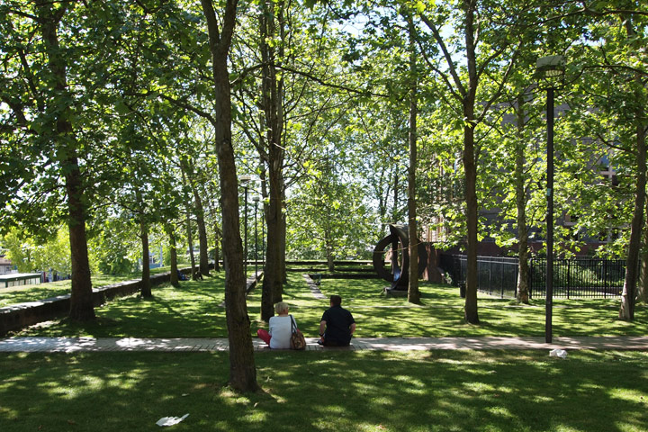
[caption id="attachment_2086" align="aligncenter" width="720" caption="Interior View Looking West"][/caption]

Topographical relief (changes in grade) is effectively utilized in the garden-plaza and provides nice seating-steps composed of both hardscape and turf. The stepping defines a sheltered place, a refuge, which combined with the shade trees to provides relief from the busy intersection and adjacent streets. Concentrically arranged, the seating-steps focus on a bronze sculpture and a children’s play area.

dappleded-light-1
dappleded-light-1

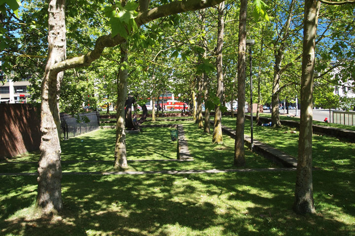
[caption id="attachment_2087" align="aligncenter" width="720" caption="View Looking East, Towards Broadway"][/caption]

A robust, rusticated wall neatly defines the landscape’s perimeter to the south and west, its materiality deftly reflecting that of the Broadway Performance Hall, just to the north (the wall was originally part of the buildings base, when it sat on the corner, prior to its being moved to its current location). On an opposite corner of the site, and at grade, wide entries welcome passersby into the landscape, and into the College, beyond. As aforementioned, sculptures (of varying levels of quality), pepper the landscape, creating points of visual interest, while another stepped-seating of turf and hardscape provides another prospect on the site northeast corner. So far, so good.

dappleded-light-3
dappleded-light-3

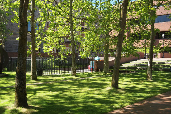
[caption id="attachment_2088" align="aligncenter" width="720" caption="View Looking North, Towards the Broadway Theater"][/caption]

As so often happens, however, the sum is lesser than of its parts; for, despite all of these apparently good qualities (taken individually), the space is a largely a failure because it is introverted and self-absorbed. Again, this would not be a bad thing, except it is adjacent to an important Capitol Hill crossroads. It is not inviting to passersby nor is it a strong landmark, two qualities it should have given its prominent location. Its relationship to its context is muddy, and in fact it denies connection to much of its surroundings. It is a public landscape by ownership only, not by perception or use.

bus-stop
bus-stop

[caption id="attachment_2090" align="aligncenter" width="720" caption="Bus Shelter and Landscape Wall Along Pine"][/caption]

The first problem with the design — if I were to order them — is the robust, architecturally appropriate wall, mentioned above. Too robust, it turns out. Too tall. Too long in its unbroken southern and western lengths, making it too daunting to surmount and gain entrance into the niceties described  above. Below, one sees the rather abrupt (and frequent) edge the wall defines. Hundreds of linear feet, I dare say, and cliff-like for more than a few of dozen of them. And what of its dutiful retention of the turf, so true to the wall’s being? Alas, it is, but too much of a burden to bear as witnessed by the diminutive Metro bus patrons (above) awaiting the 3:17 and dwarfed by, you guessed it — too much retained earth — a few too many ‘toos’, I’m afraid.

view-to-sw
view-to-sw

[caption id="attachment_2091" align="aligncenter" width="720" caption="The Southwest Corner Cliff"][/caption]

The inaccessibility delimited by the walls and grade challenges create an isolated space, an isolation furthered by the above mentioned stepped-seating, which also happens to focus inwardly. Conceptually, a contemplative space is not a bad thing, but as it focuses onto things that are not visible from the surrounding streets, it loses the opportunity  to pique the passerby’s interest and tempt entry, and populate the space. And the object of the focus: a gated playground. The playground part is fine, just not the gated part. More isolation. Less inclusive. And again, not the quality for a space at one of the most important intersections on the Hill.

view-down-broadway1
view-down-broadway1

[caption id="attachment_2089" align="aligncenter" width="720" caption="The Vacancy of Broadway along the College's Main Facades"][/caption]

On the opposite end of the too defined, too isolated spectrum of design – (both geographically and spatially)  is a space of too little definition. Yes, many of us are aware of  the expansive sidewalk betwixt SCCC and Broadway (another design issue, to tackle another day).  Not only does the expansive sidewalk damage SCCC’s frontage along Broadway, but it provides too little definition – containment – for the garden-plaza’s northeast boundary. Unlike the overly defined and inaccessible southern and western walled edges, the northeast corner spills out into a space that itself is spilling out. Double spillage? What a mess. An easy and understandable transition from one space to another is generally a positive thing in landscape, but in this case the sheer size of the Broadway sidewalk sucks the energy, the place-ness, right out of the landscape in question, and scatter-shoots it along the void that is south Broadway.

bobby-morris-diagonal

[caption id="attachment_2092" align="aligncenter" width="720" caption="And the People go on Forever . . ."][/caption]

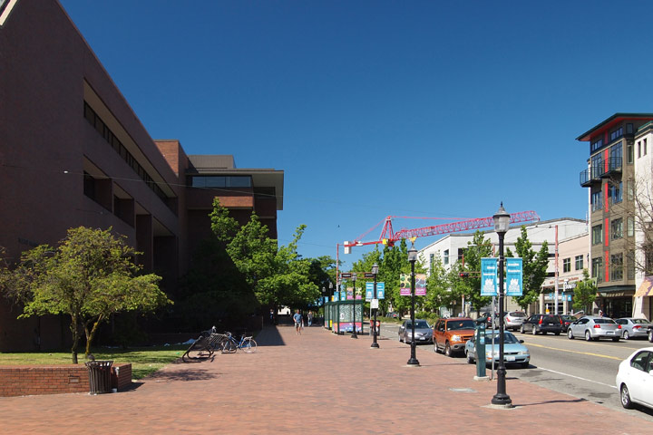
By contrast, a mere half block away, on the same sunny, 4th of July afternoon, we have another landscape (the second of our ‘two spaces’) that is almost over-burdened by its success: the Bobby Morris Playfield. “Unfair”, “cheap shot”, some would say. “It is a different space, for different needs.” “It has a program –that designer’s crutch.” Correct the nay-sayers are, but that misses the point. Despite its quality components and its different intentions from the Playfield, SCCC’s garden-plaza does lack the niceties of program, but it more importantly lacks the most important component of any public landscape — people — which Bobby Morris has in abundance. Even participants in landscapes of repose benefit from at least a few other users near by. Keeps the space, well,  public.

Sunshine . . . that’s what the folks in the Playfield wanted! Sun and action. That is why the Playfield has people, and the SCCC landscape does not. What if the blazing sunlight and programmatic crutch of the playfield were snatched away? Would the Playfield still attract people? Hmm? Well, it would, and it did, for not quite five minutes later and 200 yards to the north, I took the photo below. In the shade. No action. Just folks relaxing. Much as they would do if they were in the SCCC garden-plaza — that is if the SCCC landscape functioned as it should and attracted them.

bobby-morris-shade
bobby-morris-shade

[caption id="attachment_2093" align="aligncenter" width="720" caption="Made in the Shade . . . ."][/caption]

So, what to do with this under-performing landscape, located at a key Capitol Hill intersection and gateway to SCCC — tear it down  and build on it. “What an architect” some would cry. Destroy a lovely landscape, and put a building there. Well, say I, I would rather spend my entire day at Volunteer Park, Cal Anderson Park, or Bobby Morris than any building on Capitol Hill, so my suggestions are not from my dark, egotistical architect’s perspective, but from a lover of public landscapes. The Broadway and Pine intersection needs the kind of strong, spatial definition provided by a building, not the vacancy provided by an underperforming landscape. And given the types of shortcomings described above, renovation is not an option.

So, let us consider replacing the lovely — but woefully underperforming — garden-plaza in its entirety, with a new hybrid-use type of SCCC building and a new, contextually relevant landscape plaza. Hybrid-use I say? Yes, for this site (and all future SCCC sites) should foster a dynamic, integrated engagement with the larger Capitol Hill community. A hybrid-use building and landscape would have, among other things, 24-hour, active uses, a transparent ground floor, and recognition and enhancement of its key location on the Hill, as well as uses outside of SCCC’s traditional educational-only ones. This hybrid-use building and landscape would provide the kind of 24 hour peopling needed (by all Hill residents) for this most important site. A tall order for an institution with a mixed history of building on the Hill, and one that will require a change of approach on their part and strong support from the community on ours; however, there is new leadership at the College, and with it new perspectives that may help achieve redefined and shared goals.

Stenciled Bikes

[caption id="attachment_1774" align="aligncenter" width="700" caption="Bike lane outside Schemata Workshop on 12th Avenue."]Bike Lane[/caption] Much like Katherine I decided that May, official Bike to Work month, was a great opportunity to recommit to biking to work.  I was a fairly regular bike commuter five years ago when I worked downtown and lived in Greenwood but since then I’ve either worked close enough to walk to work or was on the road traveling for work.  The biggest difference I notice about biking now versus five years ago is all the new bike lanes, green bike lanes at intersections and sharrows (shared-lane markings) painted on the city streets.  These white stenciled bikes painted on the streets definitely make me feel like a more ligitimate user of the roadways.  As a biker I’m always hyper-aware of the dangers present when on the road.  Simple things can lead to dangerous accidents when you are on your bike such as a car door opening while passing parked cars, a car turning right across my path without noticing me, a car pulling out of a hidden driveway, the unaware driver at the four way stop who hasn’t noticed me, a newly formed pothole waiting to devour my bike, and the list goes one.  There are some drivers out there that get frustrated sharing the roadway with bikes but thankfully I have personally found those few and far between. The more common problems I’ve encountered with cars are that we bikers are just not super visible.  The good news is the image of my bike painted on the street seems to go a long way to remind my fellow car-driving road users that I and other bikers are also using the road. Seattle bike system may not be perfect and we have some ways to go before I would truly call us a bike friendly city but I am one biker that is happy with the direction we are headed.

On one of my evening rides home this month I decided to take a detour through downtown and head home along Dexter. It was fun to see the new road improvements currently underway that will create more buffered space between cars and bikes.  Later when I was looking up information about the construction I was surprised to learn that Dexter is one of the highest used bike lanes in Seattle but currently does not actually meet SDOT bike lane guidelines.  This is soon to be changed! The upgrade to Dexter will provide a substantial buffer between cars and bikes.  Most studies show buffers decrease serious bike-car accidents.  Dexter was originally slated for a Cycle Track, a two way bike lane separated from car traffic, but there was  debate on how much added safety (if any) these Cycle Tracks provide and if they were a actually a good fit for Dexter given the uses and layout of the street.  After community feedback the Dexter design was ultimately changed to provide buffer space between cars and bikes but not a Cycle Track.  That said SDOT has other Cycle Tracks proposed throughout the city. Community groups and SDOT are currently working to develop Cycle Tracks in a way that both increases bike ridership while providing added safety.

[caption id="attachment_1775" align="aligncenter" width="600" caption="Dexter road improvements currently underway will add buffered bike lanes."]Dexter Road Improvements[/caption]

Dexter and the proposed Cycle Tracks are not part of my daily Greenwood to Capitol Hill commute but I’m still very excited for these projects.  New bicycle road improvements encourage more car commuters to become bike commuters. More bike commuters increase bike awareness for drivers and bikers alike. More awareness leads to better and more creative solutions that keep bike commuters safer.  Safer bike commuters lead to more bike commuters…. It’s a feedback loop that will continue to lead us towards a more bike friendly Seattle. And this ultimately leads to a more environmentally friendly way to get all of us to work!

Bike to Work month

As many of you may know the month of May is Bike to Work month. The Schemata Workshop crew reflects on the past month and concludes that we put in a solid effort to reduce our offices carbon footprint. John Feit led our team and road to work every day, as he always does;  Dominique came in second with her commitment of biking 75% of the time and I came in last but not least biking to work 40% of the month due to a bike accident (faulty new tire) at the end of the second week. Although the rest of the Schemata Workshop crew might not be biking they arrive by either walking or taking the bus. You will typically only find one car parked at our office, our company Prius.

With my bike and body on the mend from my accident I was part of the commuting via foot group. This is certainly a commendable and sustainable approach but I reminisce about my experience riding to work. When riding not only do I decrease my commute to approximately 9 minutes, I also gain a better perspective at the start of the day. I can’t help but smile as I whizz past all those waiting at the bus stop near my house. Instead of riding along my regular walking route on Roy to Broadway then up to 12th Ave E via E John Street, I snake my way up the hill from Bellevue Ave. E on all the back streets, listening to the birds and admiring the old apartment buildings along the way, as I slowly but surely take on the hill. When I cross Broadway I gain a sense of accomplishment as I make it to the top leaving only one small hill up to 12th Ave E to go. Then the last small jaunt goes slightly downhill giving me a moment of no pedaling and a small breeze before I arrive at work - ready to tackle the day. 

Beginning my day after my energizing morning routine has been very rewarding and I look forward to being fully healed and my bike repaired so I can extend the Bike to Work month to become Bike to Work year and so on. My colleagues are going to continue to do the same. With such popularity and commitment from the Schemata Workshop crew there’s talk that our office will be creating a shelter to lock up our bikes as the entry space at our office isn’t quite big enough for 3+ bikes but more on this later....

When Cars Were Smaller, But Garages Bigger

I have yet to write about single family homes, for they are not a focus of our practice and typically are not as urban as are apartments and mixed used buildings. Nor have I written of garages or ever thought I would (except in disparaging ways), especially ones that so unabashedly front a street and dominate a building's facade.  But here I go. And to be farther off message, the garages in this post are for really large homes, on really large lots, about as far removed from dense, affordable, and urban (three values we hold) as one could imagine. [caption id="attachment_1468" align="alignnone" width="360" caption="Harvard Belmont Landmark District"][/caption]

Yet despite all of these ideological hurdles, I find the below ensemble (that is primarily in the Harvard-Belmont Historic District) quite urban, and full of useful lessons. So bear with me, and let's have some naughty fun and indulge ourselves in things we know we know we really shouldn't, but can't help not to, and take a stroll through a fancy section of Northwest Capitol Hill and admire some cool mixed function garages.

[caption id="attachment_1453" align="alignnone" width="700" caption="Example 1, West Elevation"][/caption]

The building pictured above is a combination dwelling, garage, and retaining wall, and other functions characteristic of most of the buildings pictured below. I presume it is the sole remains of a larger, no longer extant estate of the same Tudor style. The current home adjacent to this building (and I believe that of its current owners) is of a distinctly post-modern flavor, and was built in 1987, whereas the garage was built at least 70 or 80 years ago. Fronting the property line this edifice lends this single-family residential street a robust, urban character. And though the facade is dominated by garage doors (something I never thought I would even remotely praise), they are well cared for and of a very high quality (carriage doors, I believe they are called), and do nothing to diminish the building's presentation or neighborliness.

[caption id="attachment_1441" align="alignnone" width="700" caption="Example 1, Southwest View"][/caption]

The photo above provides a better view of the work that this structure performs. Note the stairs in the foreground, as well as the rip-rap wall, both in evidence of the volume of earth contained beyond. The original patrons of this parcel had the means to elevate what is typically banal fare - soil retainage and parking - to the realm of architecture and landscape.

[caption id="attachment_1445" align="alignnone" width="700" caption="Example 2"][/caption]

An equally robust wall is the Tudor's next-door neighbor, yet is of a very different character. The garage functionality remains, but the building-as-retaining wall task is here supplemented by this lovely, planted rip-rap wall. Meticulously cared for plants make this an attractive wall indeed.

[caption id="attachment_1444" align="alignnone" width="700" caption="Example 3 West Elevations"][/caption]

A couple of doors down is a third, yet equally apropos approach. While it is true that one sees the derrieres of the autos sheltered within, the design of this wall-carport combo so well echoes that of the tasty little modernist duplexes above that I could not help but include it, hindquarters notwithstanding.

[caption id="attachment_1443" align="alignnone" width="700" caption="Example 3 Carport Detail"][/caption]

Ah, a cantilever roof, that beloved modernist trope, and here dignifying a carport -- now that is attention to detail! Note how the concrete walls (with gorgeous, board formed textures), decisively cut back as they approach the roof, thus to create the cantilever. The bold horizontal lines echoes those of the pair of duplexes and the warmly stained wood ceiling add a touch of class to this most utilitarian of spaces. This is as well designed a carport as you are likely to see on the Hill, or in Seattle, and a testament that (almost) anything can be well designed, regardless of heritage.

[caption id="attachment_1447" align="alignnone" width="700" caption="Example 4 West Elevation"][/caption]

If I were in possession of them, my champagne tastes would be divulged if I were to write that this is my favorite garage of the bunch. Sure, it is the fanciest, but it is also the multitude of functions and happenings that pique my interests. Note the massive wall to the left, and how it translates into the garage structure with its strong buttresses. Again, we have extra fancy carriage doors, and some nice masonry walls. On the right, is an intimate and mysterious entry, leading to a terrace. Beyond is the manor house that lends this building its raison d'être. Again, a very urban solution (albeit ironically) to the automobile storage.

[caption id="attachment_1446" align="alignnone" width="700" caption="Example 4 Entry Gate"][/caption]

My favorite moment of all of these garages is the dark and windy stair that leads to the terrace and (presumed) guest quarters. Entered through an iron gate, what could be more mysterious or provocative?

[caption id="attachment_1452" align="alignnone" width="700" caption="Example 5 West Elevation"][/caption]

Most of us could no more afford these garages than we could the even more opulent homes they serve. Through-block parcels, of at least 10,000 sf, are beyond the reach of most of us. It is nice, though, that we get at least a hint of the dolce vita by passing so closely to these splendid service buildings. The home can be seen to the right (way, way, beyond).

[caption id="attachment_1451" align="alignnone" width="700" caption="Example 5 Stair"][/caption]

The competition to have the most splendid retaining wall/garage/garden/guest house combination must have been keen when these estates were first built, for they are all of the same style. Here, another elegant stair leads up to the garden that the garage helps support.

[caption id="attachment_1450" align="alignnone" width="700" caption="Example 6"][/caption]

Although perhaps absent of some of the refinement of the previous examples this wall/building/garage/guest quarters (anything I missed?) most likely has many more things going on than its relatively demure neighbors. I suspect that tall white walls on either side of the central pavilion define a very French or Italian inspired formal garden. Although not right on the street as the others, the espalier, box hedges, and finely trimmed bit of turf lend the edifice a formality and dignity exhibited in the best urban building.

[caption id="attachment_1442" align="alignnone" width="700" caption="Example 7"][/caption]

More modest in scale, and within the realm of what is achievable by many, this building nicely exhibits the transition from wall, to garage, to simple bungalow. Note how the bungalow is not only cantilevered, but floats above the adjacent wall. Nice!

[caption id="attachment_1448" align="alignnone" width="700" caption="Example 8"][/caption]

A familiar view to most who live on Capitol Hill, this very utilitarian structure may not have the opulence of its neighbors to the west, but its power to shape the landscape is no less. Here, the unadorned concrete (which is the structure - minus brick veneer - of the other examples) performs the same role of vehicle storage and landscape demarcation. To the right, is a finely carved out stair, similar to the others, and leading to the large home which all of this supports.

[caption id="attachment_1449" align="alignnone" width="700" caption="Example 9"][/caption]

There is probably an interesting story behind this final example. Or maybe not. But, just to the right, you can make out part the rather substantial home that I imagine, at one time, was related to the traditional base of this otherwise modernist house. Clearly, the two are not contemporaneous. Was the estate parceled out? I don't know, but I like to think there is a good story here. The garages adaptability and worthy of preservation shows both the utility and propriety of the structure, regardless of  heritage.

Don't Let Them Fool You . . .

Contrary to what you might hear, boxy buildings are okay. Even relatively big ones. What is not okay, however, is anti-box propaganda founded upon misrepresentation. There was a time, we are told, that there were no boxy buildings, that buildings were neither massive nor unarticulated, and that in order to have new buildings be good urban neighbors, they need to acknowledge this pre-box precedent. Living in a world of make believe, these Tinkerbells of design (to include architects, Design Review Boards, developers, and concerned citizens) spread their anti-box fairy dust, hoping to achieve the kinder, gentler architecture which existed before big, boxy (i.e. modern) buildings desecrated Neverland.  The fact is many (most?) of Capitol Hill's best heritage buildings are boxes, with barely a change in massing or material, and elevations that remain remarkably the same from one corner to another. These best buildings are in fact, about as boxy as a box can be. Despite ample, recent built examples to the contrary, the Tinkerbells continue to believe that the modulation of a building’s mass, both horizontally and vertically, and composing it of as many distinct materials and colors as possible, leads to good design. This has not worked, and it is definitely not precedent-based. What this modulation and material mayhem is, is design by check-list. As long as each box is checked, the final result seems to be irrelevant. What is lost in this paint-by-numbers approach is the detail -- literally. For it was (and is) in the details of a window opening or in a material transition that human scale and texture of our heritage (and modern) buildings was achieved. In was (and is) those elements of a building that can be held in one's hand, that can be understood at eye level while passing by, that add scale and 'humanity'. Not design approaches that, due to their grand gestures, can only be comprehended from across the street or down the block. While it is true that color, material differentiation, and expressive massing can add interest to a building, it is no substitute for the richness added by detail and craft. In fact, I would be more than happy to see buildings such as the one below (designed by pb elemental, on 12th Ave and John) that have some nice detail and are volumetrically and materially expressive. But let's stick to basics first before we venture into more adventurous design, and have a look at a range of Capitol Hill boxes.

[caption id="attachment_1343" align="alignnone" width="700" caption="12th Avenue and John Street"][/caption]

[caption id="attachment_1309" align="alignnone" width="700" caption="Broadway and John"][/caption]

Above, one of the few heritage buildings on Broadway that is of suitable scale for the street's importance to the neighborhood, and a fine, anonymous urban building. The terracotta surrounded residential entrance is on John, and is the only part of the building that strongly asserts itself against the predominantly brick exterior.  The ground floor and top floor are expressed by only contiguous lines of terracotta. There are, I believe, only two types of windows, and for all intents and purposes, one material and one mass. Small medallions are located at floor lines of the third, fourth, and fifth floors to add a little sparkle. The building's John and Broadway corner is unapologetically non-celebratory, nicely matching the rest of the building.

[caption id="attachment_1307" align="alignnone" width="700" caption="Belmont and E Howell"][/caption]

[caption id="attachment_1306" align="alignnone" width="700" caption="Belmont and E Howell Entry"][/caption]

Exhibiting greater boxiness, as well as greater size, than the Broadway and John building, The Granada at Belmont and E Howell is among the largest apartments on Capitol Hill and reminds me of similar apartment buildings in other large American cities. It is a time tested typology. And though I would not want an entire neighborhood of them, its very restrain adds to its grandeur, making it a robust urban building. Sadly, though, I need not have that concern; for, based on current zoning it is too large for our neighborhood in height (per zoning), and its unarticulated breadth is relentlessly long (per design guidelines). As above, the base and top are distinguished only by lines of terracotta, while the upper floor windows (of only two sizes) have an terracotta header, and those at the ground floor have a keystone set within a brick jack arch. The entrance is perhaps a bit diminutive given the building's heft, but there is no denying that it handsome and well executed -- a result of concentrating resources to where they had the greatest impact. Note the fine lamps. This building is indeed a big, flat -- yet classy -- box.

[caption id="attachment_1311" align="alignnone" width="700" caption="Bellevue between Pike and Pine"][/caption]

A favorite medium sized apartment building tucked mid-block on Bellevue, along the Pike-Pine Corridor. While at first glance it appears to be little different from the above two examples, this building employs a slightly different design strategy. Here, the windows are of uniform size and placement, and the middle floors have no distinguishing elements. Whatsoever.  Instead, the architect decided to focus efforts on a luxurious base and sumptuous roof parapet. As in the previous examples, the facade is essentially dead flat (but none the worse because of it) save for some slightly projecting trim at the second and third floor lines (why distract from the gorgeous base?). A carefully selected brick color nicely completes the material palette, and a well detailed canopy marks the building's entrance. One of the better examples on the Hill for the much coveted 'base-middle-top' design approach. And a box to its bones.

[caption id="attachment_1303" align="alignnone" width="700" caption="12th Avenue and Madison"][/caption]

A handsome edifice, indeed. The heritage portion of the Trace Lofts (the tan brick base) takes the above examples to a next logical stage: greater articulation of the facades (but wait, here's the crazy part), while maintaining material integrity and uniformity! Not prone to exuberance, the designers wanted something a little different, which is great. What is equally great is that they found it not going hog wild with garish colors and monstrous modulations, but with subtle detail and nuance of the overall design approach. Major structural elements are expressed as bays, with a secondary reading afforded by a subdivision of said bays into three more sub-bays. The cornice is more pronounced than in the previous examples, and there is a pre-cursor to the structural bay/ infill approach occurring on the ground floor, and advanced in the next two examples. Why not change materials you ask, why not a more pronounced modulation? Because it was not needed.  And by keeping the material the same, the changes stay calm and quiet -- not screaming, not annoying. And kudos to the architects (Johnson Architects, I believe) of the top floor addition. It is black, it steps back, and it disappears allowing the real focus of our attention -- the original building -- to remain at center stage. And just look at that corner. What confidence!

[caption id="attachment_1301" align="alignnone" width="700" caption="Union and 11th"][/caption]

[caption id="attachment_1310" align="alignnone" width="700" caption="Union and 10th Avenue"][/caption]

A street of buildings built like the two above would be just fine with me. A robust, concrete frame, with brick infill and large windows (almost always a winning approach) mark these two buildings as a transitional typology; one that was based on based on a rationalized constructional process optimized for an industrial economy. All bays of the buildings are essentially identical. This repetition works, though, because there is an understandable progression from the largest elements (the bays), their subsequent division and expression into individual floors (not two floors pretending to be one), to the texture within each bay; a texture created by a clearly expressing the structure verses the infill. The windows and their structure introducing yet another scale, and one arrives at a clearly understandable intermixing of materials, scales, and textures. It gets my heart racing.

At Olive and Summit we have a building, the Biltmore, which defies easy categorization, so I won't try. Suffice it to say, there is quite a bit going on here: funky corner, hyper active parapet, bay windows, and some major changes in massing. Yet despite these potential identity rending moves, it still reads as one building. What's wrong with that? It is one big building, and it is just fine that it is not trying to look like two (or more) buildings. The stepping back of the mass, of course, helps to mitigate its size; yet notice, the materials and details do not change. The stepping back was enough, and I suspect that all of the visual gymnastics of the terra-cotta, bay windows, and crenulations weren't for the purpose of making a large building to  appear to be two or three smaller buildings at all (wink, wink), but merely an architect’s eclectic vision of a single building. No remorsefulness here. And probably, no design review board, either.

[caption id="attachment_1304" align="alignnone" width="700" caption="Trace Lofts"][/caption]

Fast forward to current development. The (new) Trace Lofts is a good example of an understanding of the precedent set by the previous examples. The massing is simple, and where it steps back from the street, it does it in a bold way that creates a pleasant space for an adjacent restaurant to utilize (not a private, gated courtyard). A clear, structural frame orders both the ground floors, as well as the upper, and huge windows (with nice, shinny aluminum frames) continue the breakdown of scale while contrasting with the dark grey metal panels. Because they are floor to ceiling, the windows require guardrails, whose finish matches that of the windows and adds more (perhaps,too much?) visual interest. And finally, the metal siding. Hurray for actually designing the metal siding's profile, instead of taking it off the shelf. The bold horizontal lines succeed at reducing the buildings mass, and their strong profile adds shadow lines to the metal siding. And hey, since building codes require the building's base to be made of concrete (for fire issues), why just not leave it be? Good choice. Johnson Architects.

[caption id="attachment_1300" align="alignnone" width="700" caption="The Pearl"][/caption]

Although not as well executed as their commendable Agnes Street Lofts (nor with the same budget I would imagine), Weinstein A/U's Pearl Apartments advance some of the strategies of Agnes and is worth a look, none the less. With the frenzy surrounding modulating facades, and a typical solution being bay windows, the strategy here is relatively novel and definitely worth supporting: subtractive bay expression. Subtractive bays you say? Yes, in so much that the mass of the building remains intact, but smaller voids are introduced between them, creating bays. Although not employed by the historic examples noted above, it is of the same lineage: it relies on (dimensionally) smaller expressions to achieve its ends of breaking down mass. Similar (superficially, at least), to the rusticated base on the Granada Apartments, above, where recessed bricks add a subtle dimensionality.  The integrity of the building is maintained, while (many) smaller scaled interventions add (a great deal of) texture. A nice progression from large to small, and a very modern approach. Let's see some more -- subtraction!