Urban Living

Seattle Asian Art Museum Part 2

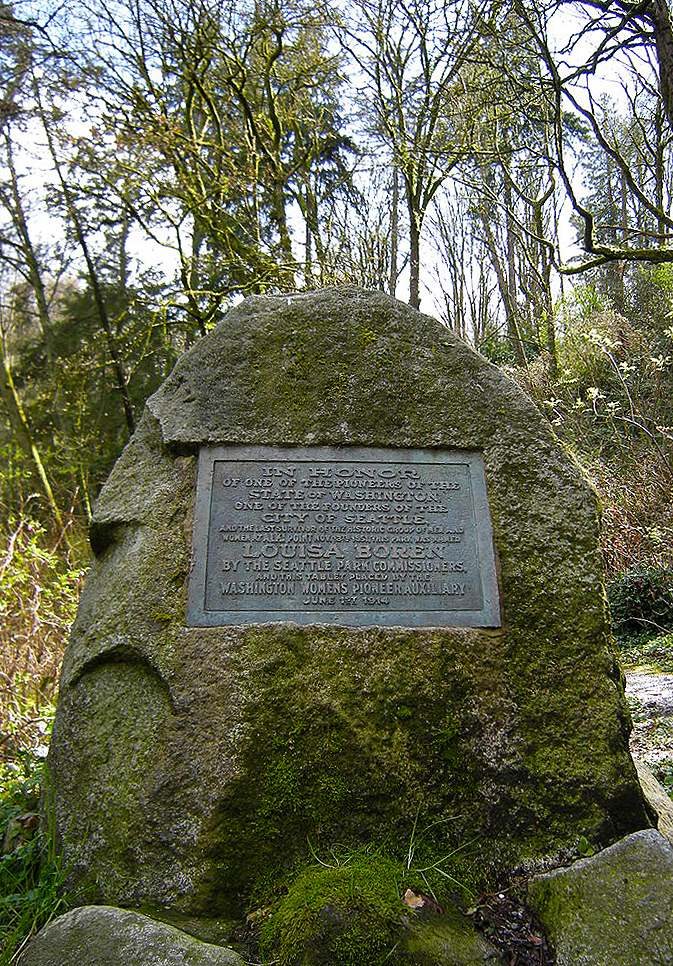
The Seattle Asian Art Museum (SAAM) comprises Seattle's greatest gallery spaces and its finest art collection. The original home of the Seattle Art Museum (SAM), it was relegated to display only a portion of it collection -- Asian art -- when the first downtown location opened in the early 1990s. While it was welcome that SAM's collection warranted additional space and a new building, it is lamentable that those newer buildings (totaling two, including the 2000's addition) have perhaps drawn attention from the original Volunteer Park home, where you will find not only an incredible art collection, but one of Seattle's finest buildings. No single space better exhibits the vibrancy and quality of both qualities than the Richard E. Fuller Court, the physical and spiritual center of SAAM's collection. Bathed in daylight, it is voluminous and resplendent in rich materials and fine sculpture. Just off of the museum's entry hall (highlighted in the previous SAAM post: http://www.schemataworkshop.com/blog/2012/03/seattle-asian-art-musuem-art-deco-splendor-in-volunteer-park/), the Court is the museum's most architecturally ambitious space and the hub off which other galleries radiate.

Copyright 2012 John M. Feit

Copyright 2012 John M. Feit

The sculpture within the Court takes full advantage of the daylight offered by the luminous ceiling, the pieces glowing in a diffuse light that evenly illuminates and reveals the skill that went into crafting these ancient pieces. Many architects struggle with using daylight in museums, leading to often drawn shades or perpetually darkened galleries that make way finding -- not to mention the display of art work -- difficult. At SAAM the architects realized the importance of daylight in displaying art and organizing the building. The Fuller Court also features a piece specifically commissioned for the space: a hand wrought, iron gate whose motifs are quite a contrast from the streamlined art deco of the museum's architecture.

Copyright 2012 John M. Feit

Copyright 2012 John M. Feit

Copyright 2012 John M. Feit

Copyright 2012 John M. Feit

Copyright 2012 John M. Feit

Copyright 2012 John M. Feit

The entry from the main lobby into the Court has columns clad in the same green granite that one finds in the lobby. Note how the stepping of the entrance walls framing the Foster Galleries (second image down) -- along with the coved ceiling within the galleries -- emphasizes the perspective, increasing the formality of the spaces. Other deco details include the aluminum handrails (a nice reference back to the entry facade's aluminum grille) and the font used to name the gallery. 

Copyright 2012 John M. Feit

Copyright 2012 John M. Feit

Copyright 2012 John M. Feit

Copyright 2012 John M. Feit

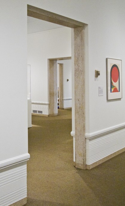
Once inside the galleries, the quality of the art pieces exceeds the expectations set forth by the quality of the architecture. A captivating mixture of sculpture, furniture, textiles, decorative arts, and paintings almost overwhelm the senses with a richness of materials and delicacy of execution. Providing a harmonious union between the art and architecture, the care exhibited by the museum's curators in the arrangement of the pieces throughout the various galleries makes for a fulfilling viewing. Each art piece is carefully staged, with the lighting and context perfectly balanced to best show off the treasures.

Copyright 2012 John M. Feit

Copyright 2012 John M. Feit

Copyright 2012 John M. Feit

Copyright 2012 John M. Feit

Copyright 2012 John M. Feit

Copyright 2012 John M. Feit

Exploring the galleries one becomes aware of the thematic elements the architects choose to both distinguish and unify the galleries. The elements of unification are at a detail level, and include door trim in stone to match that of the wall base, as well a wainscot with cleverly integrates the heating and cooling grilles. The elements of distinction are the ceilings, that provide the greatest variety of expression from coved and luminous to gently arched, morphing as one progresses deeper in the museum. Being overhead and in one's peripheral vision, the ceiling's strong charter in any given room takes a background role and does not compete with the artwork, yet has enough presence to reinforce the building's design aesthetic as well as lending each gallery a unique character. My favorite ceiling expression occurs in the gallery deepest in the back, where the arches align with large windows that provide a splendid view to Volunteer Park.

Copyright 2012 John M. Feit

Copyright 2012 John M. Feit

Copyright 2012 John M. Feit

Copyright 2012 John M. Feit

It is of course not unusual for museums to incorporate the level of detail as shown in SAAM; patrons for such buildings have the developed sensibilities that allow architects greater freedom of design than in a typical commission. And though relatively luxurious by today's restrained architectural tastes, SAAM's compact size allows for a leisurely visit that not only affords experiencing of all the building and art work with our getting fatigued.

Copyright 2012 John M. Feit

Copyright 2012 John M. Feit

Copyright 2012 John M. Feit

Copyright 2012 John M. Feit

Commanding the summit of Capitol Hill, the SAAM boasts a world class collection of art that is thoughtfully displayed in one of Seattle's most captivating buildings and greatest parks. And given that admission is free on the first Thursday and the first Saturday of every month, there is absolutely no excuse not to enjoy it soon.

Louisa Boren Lookout

Image from Wikipedia

Image from Wikipedia

Despite writing little about it I am a great admirer of landscape and Capitol Hill is a fabulous place to explore landscapes both grand and intimate. One of my favorite Capitol Hill landscapes, and the first of what I hope to be many blog posts on parks, take full advantage of our neighborhood’s surname and presents one with a grand view of Lake Washington and beyond. Named after one of Seattle’s very first European settlers, Louisa Boren, Louis Boren Overlook (park) comprises a little over seven acres, most of which are on a slope connected to the much larger and wooded Interlaken Park.

The big draw is the tremendous view it provides one the opportunity to enjoy. The park also has many design elements of a smaller scale which work almost transparently to reinforce the powerful vista. Included among these elements is a running path bisecting the upper portion of the park. The path provides a nice venue from which to engage both the distance views of Lake Washington and the Cascades, as well as some of the neighboring homes.

Copyright 2013 John M. Feit

Copyright 2013 John M. Feit

Copyright 2013 John M. Feit

Copyright 2013 John M. Feit

The path is framed by higher ground to its west (non-view) side; the mound also forms a visual and acoustic barrier to the heavily traveled 15th Avenue as well as a nice sense of enclosure, reinforcing the view to the east. The curb, seen to the far left of the above image, provides the subtlest of definers, gently offering a modest edge just before the land drops about 180 feet into Interlaken Park.

Copyright 2013 John M. Feit

Copyright 2013 John M. Feit

A regular to the park, I can attest that a favorite prospect is defined by a solitary tree, surrounded by a bench and railroad ties. Just right for two people to enjoy; with many a couple being seen there at any given time.

Copyright 2013 John M. Feit

Copyright 2013 John M. Feit

To the southwest of the lover’s bench, there is a 1975 sculpture in raw steel by Oregon artist Lee Kelly, sited on the highest grade in the park.

Copyright 2013 John M. Feit

Copyright 2013 John M. Feit

Copyright 2013 John M. Feit

Copyright 2013 John M. Feit

Copyright 2013 John M. Feit

Copyright 2013 John M. Feit

The park’s real treat is, of course, its view. In any season, and with a clear sky, the democracy of our Seattle park system reveals itself giving to us all views that are typically reserved to a select few. The view is particularly captivating if you are fortunate enough to catch it on a clear winter’s day, when sunlight bathes the freshly fallen snow in the Cascades, distinguishing their noble profiles and as it did on a clear and cold morning January 2nd, 2013.

The Kingshire: A Mid-Century Sleeper on Harrison

Every time I walk by the Kingshire, at the intersection of 14th Avenue  East and  East Harrison, I flatter myself and wonder if I am the only one who appreciates its dignified and restrained design. After all, it is only a white box with a relatively flat facade and an entry that hardly gives one pause. Despite these attributes (or because of them), the Kingshire is a little beauty with a subtle complexity to it and is a great example of many of the finer points of modernism. Among these is the nifty way the building touches down on its site, with its brick façade wall held up by diminutive pipe columns supporting a steel lintel. Both the scale of the columns and the void they create are certainly a reference to the design prerogatives of modern masters such as the Swiss architect Le Corbusier, whose pilotis (columns that allow for the raising of a building in order to let the landscape pass underneath) became a modernist icon.

The Villa Savoye (1929)

On the Kingshire, the height afforded by the columns is of a decidedly smaller scale than that of the Villa Savoye, and most likely is a recognition of this building’s urban setting and its need to create a strong street edge. The roof too makes a nod toward Le Corbusier, with its lushly planted roof garden and well-tended foliage gracefully hanging over the parapet. Between the pilotis and roof garden (and setting up the base, middle, and top architects do so love) is the middle facade where the shifting of widow openings and mullion patterns from floor-to-floor, as well as a pair of subtractive windows (perhaps another reference to the Villa Savoye?), reveal the Kingshire to have a host of latent surprises.  Such variety in articulation is a fine example of how even a slight alteration in an otherwise regularized design vocabulary is effective at achieving variety and nuance. Note how the third floor corner windows have either more tightly spaced mullions, a flipped orientation compared to their lower floor brethren, or are even subtractive.  Best of all, these design distinctions a grounded within the building’s simple vocabulary.

Painted white to achieve a certain level of modernist abstraction, the building convincingly uses brick as its skin.  Modernism generally eschewed brick as being too traditional, instead preferring white stucco. None-the-less, the brick here provides a reliably crisp edge around the openings; perhaps the most effective single detail one can lend a building to give it a sense of scale. Built in 1957, the Kingshire is one of the Hill’s most handsome modernist buildings. Sadly for us, there are not many examples of its type, which is a shame as its design has an economy and suitability that would make new derivations of its design precedence most welcome even 55 years later.