Capitol Hill's Modernist Enclave

Tucked away on a narrow, winding street on the north end of Capitol Hill lies an enclave of modernist homes dating from an early 20th Century masterwork to those that aspire and are just completing construction. Some are exemplary, some are rather ordinary, but their grouping on the same compact hillside of Capitol Hill compounds their inherent charms and attraction.

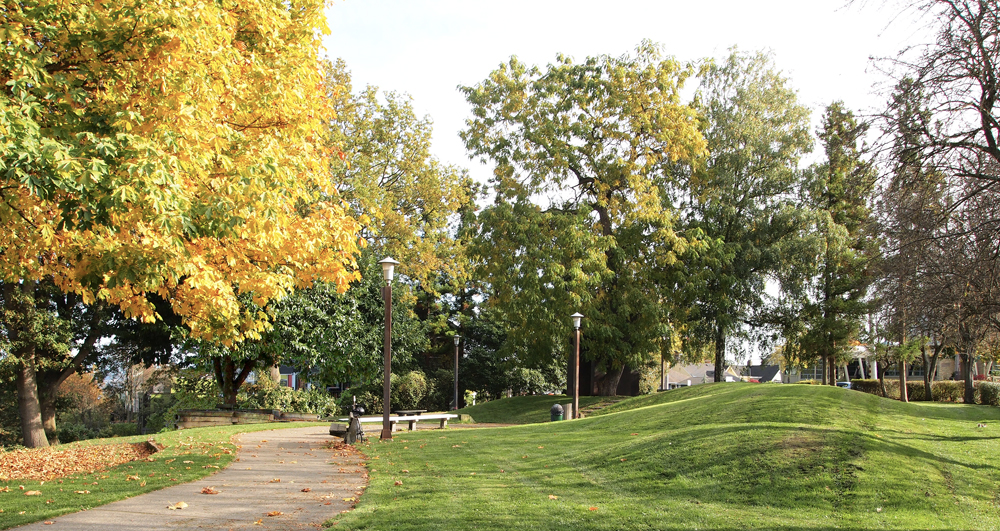
East Boston Terrace escaped my notice for years before its very existence was pointed out to me by another aficionado of modern design. At the panoramic viewpoint where East Boston Street dies into 15th Avenue East, Boston Street’s continuation could easily be confused with a driveway.  The street quickly dives into the hillside, disappearing from view, with its steep slope leading one to a protected and sheltering environment.

13_0112 Steep Stair small.jpg

Coming from the south along 15th Avenue, the first hint of this micro-neighborhood’s presence is the rather long, moss covered stair that takes you from the 15th/Boston bend down to Boston Street itself.Once down the stair, one is greeted by the newest addition to the mod-enclave, a tasty red and tan home, whose materials, massing, and color make it very au courant. Still under construction the chilly January morning I did my most recent walk, the building’s rather austere front elevation is in contrast, I imagine, to a fully glazed one opposite, and intended to capture what must be spectacular views to the east.​

13_0112 Under Construction small.jpg

Next up on the tour of modernist boxes (and I use that term in the most affectionate way), is a little grey number that I would guess is of late 1970’s or early 1980’s vintage. The tightly spaced vertical siding and the glass canopy at the entry are amongst the clues. To the right you will notice the ‘outie’ balcony; a classic modernist move. One also may notice that the car port is actually a bridge, a hint of further hillside gymnastics to come.

13_0112 Boston Grey House at Top Small.jpg

Skipping over the next building (saving the best for last), a Frank Lloyd Wright-inspired, prairie-styled dwelling commands the fork in the road. A beautifully tended landscape is fitting for a home so sited and inspired. The hip roofs and stone base help the home  blend into its surroundings, much in the manner Mr. Wright preached it ought to. ​

13_0112 Prarie Style Mass.jpg

E. Boston Terrace’s relative seclusion reveals itself the further one progresses into its realm, with the closest neighbors looming above, their yards forming an effective demarcation from the rest of Capitol Hill. Spatially, this juxtaposition of higher and lower elevation homes in a compact space is reinforced by the homes not being aligned on the grid one typically finds in our neighborhood. Seen here in the foreground are two less obvious modernist homes. A little closer up, the rambler may appear more suburban than not, but I cannot help but speculate that when constructed, such a distilled domestic image was certainly at odds with the craftsman bungalows that filled Seattle, making this home a trend setter for its time. A subtle move to be sure, but the way the home allies itself with the curve of the street hints at its less-than-traditional posture. ​

13_0112 View up Hill small.jpg
13_0112 Small Rambler small.jpg

The hillside situation of Boston Terrace not only produces interesting visuals on the uphill side, but as you can imagine, on the downhill side as well. On this particular morning, I was fortunate enough to catch a view of the Cascades in all its winter splendor.

13_0112 View.jpg

Backing this spectacular view is a more recent contemporary home. While it’s difficult to discern its exact vintage, the split face concrete block at the base hints at the 1990’s.  That presumption is partially undermined by the apparently steel-sashed windows which typically hint at a much older home. Kudos to both architect and owner for seeing the value in installing such gossamer windows – their delicacy and transparency come at a premium price – but, with the view they engage it was clearly worth it. Another nice modernist touch is the simple and highly ordered landscape, comprised of uniform and geometrically deployed trees set in a carefully manicured ground cover.

13_0112 Rambler Small.jpg

The infrastructure enthusiast in me is impressed by the extent to which bridges and roads are engineered to provide access to these otherwise inhospitable locales. I could not help but be impressed by the determination to build a road on this hillside. Have a look at the pilings supporting the roadway/bridge in front of the home just discussed.

13_0112 Road Support Small.jpg

Now for la pièce de résistance and the true inspiration for this post -- a great white box that sits across from the above-mentioned prairie style home. The term modernist gets thrown around a lot, including by me. Despite this etymological transgression, there is an image that I and many others hold as truly modernist --  that of the early 20th Century, European-based, International Style pioneered by architects such as Walter Gropius. Although by no means ignored in the United States, it never quite captivated the imagination as it did across the Atlantic. To be sure, later American designers took such inspiration and molded it as their own, as shown by the designs of such masters as Eero Saarinen and Craig Ellwood. These later accomplishments aside, the pure white box antecedent was rare in the US, and rarer still in the Northwest (as opposed to California, the upper Midwest, and the Northeast). However, we do have at least this one on the Hill, and it is such an outstanding example it almost makes up for the dearth of others. ​

From the looks of it, this home falls squarely in the 1930’s, and my guess is the work of Paul Thiry, one of Seattle’s legendary architects whose oeuvre includes Key Arena and much of the related planning for the 1962 World’s Fair. Not that authorship matters here, as regardless of designer, it is exemplary of its type and a real treasure. Based upon previous strolls on Boston Terrace, it appears to have had some recent restoration work performed, and is sporting at least a fresh coat of paint and restored (or at least tidied-up) steel windows.

13_0112 Thiry House 1 small.jpg
13_0112 Thiry House 2 small.jpg

The house itself has all the modernist cues: cubic form, bone white paint, steel corner windows, entry canopy, and assertive chimney. How I dream of more such beauties to be on the Hill -- even the perennially abused glass block is perfectly incorporated into the design! Greater than the sum of its parts, this house also displays a deft hand at proportion, scale, and overall execution that makes it among the Hill’s finest looking residences, all reason enough to take a stroll into Capitol Hill’s modernist enclave and witness is beauty first hand.

Strength in Numbers

In cities and settlements throughout the world the repetition of even a passing resemblance between neighboring structures has lent dignity to many an urban environment.  Siena, Italy, comes to mind as an instance of the first order, where the matching architectural qualities of the city define its great beauty. Closer to home, the justly famous brownstones of New York (so-called because they were built of locally sourced, brown stone) are among some of the country’s finest residential neighborhoods.

Source: Wikimedia

Yet this repetition can be a double-edged sword. Our ubiquitous suburbia is the most banal of environments, with its cookie-cutter homes and shopping malls, endlessly repeating the same massing, materials, and details, resulting in pure misery.

On Capitol Hill, we too have instances of matching buildings, which run the gamut from those that enhance our neighborhood to those that tarnish it. 10th Avenue East, between Aloha and Roy Streets, holds forth a positive example of repetitive buildings. Architecturally, these facing comrades are virtually identical, with two on the western side of the street and four on the eastern side. I have long been a fan of these six buildings, not only because they are dignified little structures, but because their repetitive nature highlights their individual qualities.

Copyright 2013 John M. Feit

Besides the match of overall form and materials, sameness is provided by the stairs, building set-backs, and the landscaping, much in the manner of the above-mentioned New York City brownstones. Yet unlike them, these masses are separate, allowing for additional shared elements to present themselves, such as alleyways, facing facades, and archways.

Broadway 4 Detail 1 Small.jpg


Copyright 2013 John M. Feit

The fact that they share characteristics raises some questions that no one of them standing alone could: Were they built all at the same time? Are the floor plans identical? Was there a specific tenant in mind? Did the same developer build both sides of the street? The answers themselves are not really important.  What matters is that the curious uniformity and repetition has some sort of story behind it, prompting questions that enrich one’s experience.

Further north on 10th Avenue East at the northern extremes of Capitol Hill, one finds a striking threesome of buildings that are identical in all but name. Much larger (individually) than the six to the south, these three provide an anchor to their section of 10th that confirms one’s presence in an urban neighborhood.

Copyright 2013 John M. Feit

In addition to being rather handsome, well-proportioned buildings in their own right, the fact that they match, have the same negative spaces between them, and uniformly step down along 10th Avenue reinforces their presence, strengthening the streetscape and sense of place. Though the three lack the additional matching elements of the first example, their more cubic nature and repetitive fenestration lends them an equally strong character.

Copyright 2013 John M. Feit

My favorite matching buildings on Capitol Hill are, actually, the least matching of all. The Buckley and Sheffield apartments, while not identical like the above apartments, convey a different and perhaps more powerful example of the matching theme through their sharing of a rather unique element: facing corner entries. There is even a third building nearby -- an odd-one out -- that still provides continuity with the others due to a similarly high level of material and detail.

Copyright 2013 John M. Feit

Placed within a (very) broad historical context, I cannot help but to be reminded of one Rome’s most famous landmarks, the "twin" churches of Santa Maria in Montesanto (1662-75) and Santa Maria dei Miracoli (1675-79). Back in the day, this kind of intentional design – matching buildings to form an urban gateway – was novel and rather groundbreaking and required a big, urban type of thinking that had hitherto been rare. Unfortunately, such larger urban thinking in smaller environs such as Capitol Hill remains elusive, one reason why the Buckley and Sheffield merit special attention.

Source: Wikimedia

The mirrored pairing of the Buckley and Sheffield is but one of their notable attributes, as the buildings’ execution is a step above typical, Capitol Hill apartment building fare. Subtle brick patterning and terracotta trim indicate the higher aspirations held by the developer. A peek into the lobbies through the stained glass windows reveal that equal attention was paid to the interior environment. Though this pairing may be without precedent on the Hill, it is not without descendants.

Copyright 2013 John M. Feit

Directly to the south of the Buckley is the Whitworth, whose detail and material exceeds the vitrual twins across the street. More questions arise – were these three planned together, and if not, which came first? Did someone anticipate the city arriving, and the rest of the surrounding single-family neighborhood never caught up, leaving these three urban pioneers stranded? Whatever the answer, the mere query suggests there may have been some sort of planning in the entire collection, of thought given to a neighboring context and a choice to create one anew -- indicating big ideas for this little intersection at East Harrison and 17th Avenue East.

Copyright 2013 John M. Feit

Despite the above examples, such repetition, use of thematic elements, and uniformity of height, bulk, and scale, has led to disastrous results.. In the case of much suburban development the obvious reasons include the lower quality of design, including the lac of design of the larger environment inhabited by the structures. Probing more deeply, I would include quality of materials,  the use of well-executed and scaled details and thoughtful material interfaces as contributors to Capitol Hill’s fine examples.. Compactness and density too, play a role in establishing the higher quality of Capitol Hill’s matching buildings; yet bad examples are present on the Hill as well, proving that there are no guarantees for success in design and that we are at least fortunate enough to have some good precedents to follow.

Louisa Boren Lookout

Image from Wikipedia

Image from Wikipedia

Despite writing little about it I am a great admirer of landscape and Capitol Hill is a fabulous place to explore landscapes both grand and intimate. One of my favorite Capitol Hill landscapes, and the first of what I hope to be many blog posts on parks, take full advantage of our neighborhood’s surname and presents one with a grand view of Lake Washington and beyond. Named after one of Seattle’s very first European settlers, Louisa Boren, Louis Boren Overlook (park) comprises a little over seven acres, most of which are on a slope connected to the much larger and wooded Interlaken Park.

The big draw is the tremendous view it provides one the opportunity to enjoy. The park also has many design elements of a smaller scale which work almost transparently to reinforce the powerful vista. Included among these elements is a running path bisecting the upper portion of the park. The path provides a nice venue from which to engage both the distance views of Lake Washington and the Cascades, as well as some of the neighboring homes.

Copyright 2013 John M. Feit

Copyright 2013 John M. Feit

Copyright 2013 John M. Feit

Copyright 2013 John M. Feit

The path is framed by higher ground to its west (non-view) side; the mound also forms a visual and acoustic barrier to the heavily traveled 15th Avenue as well as a nice sense of enclosure, reinforcing the view to the east. The curb, seen to the far left of the above image, provides the subtlest of definers, gently offering a modest edge just before the land drops about 180 feet into Interlaken Park.

Copyright 2013 John M. Feit

Copyright 2013 John M. Feit

A regular to the park, I can attest that a favorite prospect is defined by a solitary tree, surrounded by a bench and railroad ties. Just right for two people to enjoy; with many a couple being seen there at any given time.

Copyright 2013 John M. Feit

Copyright 2013 John M. Feit

To the southwest of the lover’s bench, there is a 1975 sculpture in raw steel by Oregon artist Lee Kelly, sited on the highest grade in the park.

Copyright 2013 John M. Feit

Copyright 2013 John M. Feit

Copyright 2013 John M. Feit

Copyright 2013 John M. Feit

Copyright 2013 John M. Feit

Copyright 2013 John M. Feit

The park’s real treat is, of course, its view. In any season, and with a clear sky, the democracy of our Seattle park system reveals itself giving to us all views that are typically reserved to a select few. The view is particularly captivating if you are fortunate enough to catch it on a clear winter’s day, when sunlight bathes the freshly fallen snow in the Cascades, distinguishing their noble profiles and as it did on a clear and cold morning January 2nd, 2013.

The Kingshire: A Mid-Century Sleeper on Harrison

Every time I walk by the Kingshire, at the intersection of 14th Avenue  East and  East Harrison, I flatter myself and wonder if I am the only one who appreciates its dignified and restrained design. After all, it is only a white box with a relatively flat facade and an entry that hardly gives one pause. Despite these attributes (or because of them), the Kingshire is a little beauty with a subtle complexity to it and is a great example of many of the finer points of modernism. Among these is the nifty way the building touches down on its site, with its brick façade wall held up by diminutive pipe columns supporting a steel lintel. Both the scale of the columns and the void they create are certainly a reference to the design prerogatives of modern masters such as the Swiss architect Le Corbusier, whose pilotis (columns that allow for the raising of a building in order to let the landscape pass underneath) became a modernist icon.

The Villa Savoye (1929)

On the Kingshire, the height afforded by the columns is of a decidedly smaller scale than that of the Villa Savoye, and most likely is a recognition of this building’s urban setting and its need to create a strong street edge. The roof too makes a nod toward Le Corbusier, with its lushly planted roof garden and well-tended foliage gracefully hanging over the parapet. Between the pilotis and roof garden (and setting up the base, middle, and top architects do so love) is the middle facade where the shifting of widow openings and mullion patterns from floor-to-floor, as well as a pair of subtractive windows (perhaps another reference to the Villa Savoye?), reveal the Kingshire to have a host of latent surprises.  Such variety in articulation is a fine example of how even a slight alteration in an otherwise regularized design vocabulary is effective at achieving variety and nuance. Note how the third floor corner windows have either more tightly spaced mullions, a flipped orientation compared to their lower floor brethren, or are even subtractive.  Best of all, these design distinctions a grounded within the building’s simple vocabulary.

Painted white to achieve a certain level of modernist abstraction, the building convincingly uses brick as its skin.  Modernism generally eschewed brick as being too traditional, instead preferring white stucco. None-the-less, the brick here provides a reliably crisp edge around the openings; perhaps the most effective single detail one can lend a building to give it a sense of scale. Built in 1957, the Kingshire is one of the Hill’s most handsome modernist buildings. Sadly for us, there are not many examples of its type, which is a shame as its design has an economy and suitability that would make new derivations of its design precedence most welcome even 55 years later.